Monday, 13 January 2014

New Year. Time For A New Banner.

When I first started this blog, I wanted an eye-catching picture at the top of the page. Given the title of this blog, with it's Ludlumesque (in my view) overtones, I wanted a picture that reminded me of those classic airport-thriller book covers that I bought in the Seventies and Eighties;

picture courtesy of www.existentialennui.com
pic courtesy of www.doubleosection.blogspot.com

picture courtesy of www.bearalley.blogspot.com.au
(I almost called this blog "The Teeritz Protocol"  when I first set it up, but felt that Agenda seemed like the better choice of wording.)

However, I wanted the picture to reflect as many of my interests as I could cram into the frame, while still leaving room for the blog title to appear. And, since I would be using a bold, upper-case block font, I didn't want to obscure the title.
So, I spent quite some time arranging the items in the photo so that they would not obscure the text when viewed on a computer screen.

This here picture was my first attempt;


It worked well-enough, I suppose, and it showed a neat little mix of my wristwatches (my main love), a short snippet of my Bond fan-fiction, and a fountain pen and corner of a typewriter. This seemed to reflect what I was into when I first started this blog.

This picture was okay for a while, but I wasn't crazy about using a manila folder for the background because a corner of the table was visible underneath. My wife liked this banner picture and was surprised when I decided to change it.
The next photo would be a little more ambitious. A few more items strategically arranged, but still needing to keep a percentage of the frame blank for where the blog title would appear. And, since I'd just recently purchased a new camera with some interesting filter software in it, I decided to have a play around and see what I could come up with;


Sure, it was okay, but it always seemed a little too wide for my liking. I wanted it to look a little more widescreen to subliminally reflect my interest in film. And, to mimic the cover-art of the vintage Ian Fleming hardbacks of the '50s and '60s...


...I wanted the photo to look a little more like a water-colour or trompe l'oeil-style painting like the Bond book art painted by the legendary Richard Chopping. 
I was reasonably happy with the end result, but something about it always niggled at me. Maybe it looked to me like there was too much dead space in the frame. 
Although, I have to say it looked pretty neat seeing it through Google Translate;

German

Japanese (very anime)

Russian (ahh, yes, The Cold War)

And so, over the past couple of days, I thought about re-doing the banner. It's was as good an idea as any, I suppose, and I may switch it back to the old photo anyway if I tire of this one. 
I still wanted the picture to reflect the things I'm into, but I couldn't find a way to add some of my own creative writing. Looking back, I should have typed up half a page of a screenplay and left it sticking out of the Royal QDL. Ah, well...
Still, the watches are well represented, as are the books. I'm into classic American crime fiction and you would all know by now that I'm a Bond fan. The auto-focus was set to capture the Omega planet Ocean dive watch and the book spines clearly enough. The Persol sunglasses were thrown in to provide some more contrast against all of the warm tones. Looking at it now, some psychoanalyst would say that it would "signify your wish to remain anonymous on the internet, Herr Teeritz." Perhaps. I suppose this is why you'll not see any detailed pics of me or my family on this blog.

There's enough of the Royal QDL visible for even a novice to recognise it as a typewriter. I chose the Royal because it has a real typewriter look to it. To my mind, anyway. And it was a scorching hot day yesterday when I took the photos, so this provided a glow through the venetian blinds. Man, when we move to our next house, I'm gonna have to install wooden venetians first thing. They're so photogenic.

Lord knows, I have numerous versions of this photo, plus others that I took, to choose from;

The picture below shows the same effect as what's been up for the past year. I chose not to use a picture with a camera in it since I don't consider my photographic skills to be sufficient, and I don't want to confuse any readers who may stumble across this blog thinking that it's a photographic blog.


Soft-focus effect for that old Hollywood look.


Black and white to make it look like some kind of surveillance photo.


Again, if I decide to change the banner picture, I'll have to crop the replacement so that it's narrower than these.
Anyway, this seemed like a pleasant way to while away an hour or so as the temperature climbs to 43 degrees Celsius.
Man, it's hot! Sorry, I know that many of you out there are currently struggling through Winter, but man, it's hot here in my town today! 

Thanks for reading, and looking, all!

Thursday, 9 January 2014

Friday 10/1/14 - Creepy Playstation Games, Gin & Tonics & This Week's Watches

Friday, 3:15pm AEST
 
Last Saturday
It was my birthday, so the kids came running into the bedroom at some ungodly hour (probably 9:00am) to give me my presents/gifts;


It'll take me about six months to get through that bag of Kettle Chips. The bag is just slightly smaller than the pillow on my bed.
The Capi Tonic Water will come in very handy, and I  played the first level of the PS3 game, "The Last of Us", later that night after the kids had gone to bed. I have to say that I don't normally go in for survivalist horror games. They can be pretty creepy, but this particular game has been very well-received in the gaming press.
 I remember playing "Resident Evil 2" on the Playstation 2 many years ago and I had some very vivid and violent dreams before I decided that I didn't like that kind of game. Needless to say, I'll be playing this one cautiously. On my own.
I was touched by the effort that the kids put in to making the birthday cards. That would explain the mild swearing that I heard from my son's room the day before. Must've driven him nuts doing that drawing, so I admire the effort. And my daughter's card has a typewriter theme going on. Nice.
 
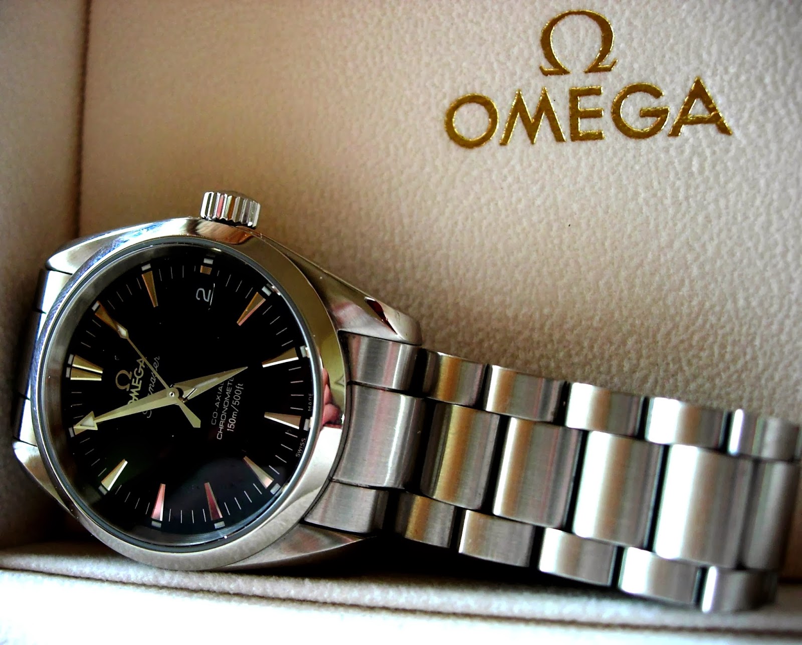
Later in the afternoon, I busted open the Tonic Water, wearing the Omega Seamaster AquaTerra;
 
 
I love the label on this bottle. Very 1960. Perhaps I was waiting for Jack Lemmon or Audrey Hepburn to come around for a G&T.
 
We went out to Grill'd for a burger. We decided to go someplace local. The Christmas/New Year period was fairly low-key in our house and we continued the theme with a nice, pleasant family outing. It was a cool evening, weather-wise. And here we are, in the middle of Summer here in Australia. I wore my Hard Yakka Flying Jacket, which is based on the classic MA1 Bomber jackets that were first designed in the 1950s. I felt like Chuck Yeager.
Well, I had the Right Stuff on my wrist, at least.
The Omega Seamaster 300 on a TrueBond NATO strap.


Felt a little bored that afternoon, so I got to work on one of these;


Monday Evening
Felt like a drink before dinner, It was time for an Old fashioned. The only bourbon I had was Slate. It's okay, I suppose, but I gotta get a bottle of something else. I'd switched over to the Omega Railmaster;


Tuesday
Some purple typewriter ribbons arrived from eBay. These are great. They make your writing look like carbon copies and, since I see enough black ink in newspapers, magazines and books, I'd decided to get some ribbons that had a little more colour. Might look at getting a few more of these and perhaps a blue one as well. Although, the blue ribbons do print a little lighter than I'd prefer;


Tuesday Evening
We all sat down to watch the last few episodes of the final season of "30 Rock". Tina Fey is a comedy genius and Alec Baldwin was perfectly cast as slick business shark, Jack Donaghy. The rest of the cast were superb. Tracy Morgan, Jack McBrayer and Jane Krakowski were wonderful throughout the seven-year run of the show. Given how much generic and predictable crap there is on the small screen, to say nothing of all the reality-TV garbage, this is one show that I'll miss, given that I don't tend to watch much TV these days.


Thursday
Time to finish painting the garage door. However, the weather had reached a hot 30 degrees Celsius (Hello, Summer, did ya finally decide to turn up?). Still, that door wasn't gonna paint itself.
Switched over to the Seiko 7002. Didn't bother setting it to the correct date;


Man, it got hot out there! Finally. Later that night, it was Gin & Tonic o'clock and I switched to the Sinn 103;


Today
It's currently 33 degrees Celsius as I write this. I'll be heading out later this afternoon. My cousin called me earlier this week about going to the Designing 007 exhibition. As you may know, I've already been, but I haven't seen my cousin in over a year, so this'll be a good chance to catch up. I'll be switching to more tropical attire. A pair of bone-coloured chinos and a light blue, short-sleeved cotton shirt with epaulettes to give me a slight Ian-Fleming-at-Goldeneye vibe. And, I'll switch over to a watch on a strap.
Normally over Summer, I tend to wear watches that have metal bracelets rather than straps. This way, the leather doesn't get undue wear-and-tear from perspiration, water, sun-tan/moisturising creams, etc.
However, tonight's watch is the Camy Club-Star, on a nylon NATO strap in red, white and blue.
Team USA! Rule Britannia! Vive Le France!


Thanks for reading and have a great weekend, all!

Tuesday, 7 January 2014

Ballpoint Pen No. 1 - The Aurora Model 98, Circa 1974


Normally, I wouldn't go for a gold pen, but this one has a nice design. There's just a hint of black lacquer in the clip, but it looks a little rough. I think it may have broken off during its years in storage. The clip itself is sturdy enough and, to me, that's the main thing.


The ballpoint itself doesn't protrude too far out of the barrel, but this doesn't affect the writing or the angle at which the pen can be held.


The pen writes nicely. The Schneider Office 575 medium blue refill is a great value-for-money. About half the price of other refills. Here's a writing sample, courtesy of Springsteen's Born to Run album;
EDIT: Third line should read "contacts", instead of "contracts". I was working off memory rather than the lyric sheet from the album.

I've been told that this Aurora Model 98 is fairly collectible due to its rarity. In saying that, I've seen some similar pens on eBay that sold for very little.


It's a nice all-round ballpoint pen. Perfect for daily use. Slim and light enough to write with for long periods, and the refills are easy enough to get hold of. Which is all I ask for from a pen.


Thanks for reading!


Friday, 3 January 2014

Friday 3/1/2014 - Artist's Colonies, Peacocks, Pink Champagne (but we can't call it that if it was produced outside of the Champagne wine region of France), and This Week's Watches.


My daughter taking a photo of a plaque near the entrance. While a raven looks down ominously.


One of the cottages used by an artist-in-residence. Yep, I could get a lot of writing done in a place like that. Could hang out a shingle too.

Must take 'em hours in the morning to arrange those feathers in their scalps.


My family was outnumbered by the peacocks. This guy was the clear winner with the long feather-train. Dem ladeez don't stand a chance.


One area was a grave-yard for old machinery. I don't know what it used to be for, but it looked well-worn and noble. Perfect for a watch shot. 


 A picture of the chapel, which is available for wedding hire. It looked great inside. Naturally, my kids made a bee-line for the organ and played some excrutiating 'music'.


Okay, enough musing. Time to get ready for a New Year. I had to switch wristwatch. Over to the Omega Seamaster AquaTerra;

We had a quiet one. I started on the bottle of sparkling wine, because if it doesn't come from the Champagne region in France, then it can't be called champagne. Fair enough. The kids stayed up for it this year. We counted down the last ten seconds of 2013 as cheers came from neighbouring houses and fireworks were heard in the distance.
See ya, 2013. You won't be missed too much.
Hello 2014, let's go easy on each other, shall we?

Tuesday afternoon, circa 4:00pm
Over on a wristwatch forum that I frequent, there's one member who sent me a 1960s Garland ballpoint pen. He commented earlier that he hadn't seen any pictures of my watch with "a cool '60s era pen".
And so;


 Sorry, all. It's an old photo.

Today
Went and paid those bills that arrived yesterday. Managed to tidy up my desk. Found the list of subjects that I have yet to complete for the library course that I'm doing. Have to go and re-enrol later this month.
And that's it for this week. Switched back to the AquaTerra. Again, it's another old photo.


Anyway, have a great weekend, all, and I hope 2014 has gotten off to a nice start for you.
Cheers and thanks for reading!

Hmm, 10:20pm. I had hoped to get this up by 9:30, like the first page stated, but the best-laid plans of mice and men, etc, etc.

Thursday, 26 December 2013

Friday 27/12/13 - Christmas Week, More Bond Stuff & This Week's Watches

Friday, 6:20pm AEST
 
Yes, it's been a slow one this week. And yet, it was a blur. Can't remember what wristwatch I was wearing last weekend. I think it was the Sinn 103. It's my go-to watch when I'm beginning to forget what day it is. This normally happens around the time of public holidays where the days begin to get slightly askew.
 
Monday
Still had the Sinn on my wrist;


Tuesday
I had a few errands to run. Don't ask me what they were because I can't remember. I found a great website about a year ago, called www.everyday-carry.com.
Basically, people submit photos of the stuff that they, you guessed it, carry around every day. Some of the photos are fantastic. I'm surprised by how many folks carry a knife and torch on a regular basis.
Feeling a tad inspired, I set up a shot of what I had planned to carry that day. It ain't much, but it's all mine;

 
*Leather credit card holder
*Lamy Logo ballpoint pen
*Persol 2679-S sunglasses
*Moleskine pocket-sized notebook
*Sinn 103 St Sa automatic chronograph

Thursday
Switched over to the Omega Seamaster AquaTerra Co-Axial on Christmas Day (Wednesday). Still had it on when I mixed up a gin & tonic to combat the heat here in Melbourne. And yes, I added a slice of lime instead of lemon.


Today
Nipped out to do some banking this morning and stepped into a store called Big W to get a notepad. And I also found this Vintage 007 Collection boxed set.


I've flicked through a couple of these versions over the past six months, debating whether or not to buy them. I have at least three different cover-art versions of every Bond paperback. The thing about these editions was that they had an introduction in each of them written by a modern author.
These Vintage editions would cost me $12.oo each if I were to buy them individually. This set was in amongst a bunch of Tolkien Hobbit/Ring Trilogy and "Game of Thrones" boxed sets. The price above this display said $75.00.
"Hmm, not bad. Fourteen books for seventy-five bucks. What's that, about five bucks each, give or take? Maybe I can put it on lay-by (lay-away)", I thought to myself.
Just to be certain, I grabbed a box and took it over to a nearby price scanner. I waved the barcode underneath the scanner and the little screen lit up with;
 
837XXX
BK JAMES BND SLPCS
$50.00
 
SOLD!!! For fifty bucks, it worked out to approximately $3.57 per book. I grabbed it and got the hell out of there. Yes, Virginia, there really is a Santa Claus.
When I got home, I flipped the box over and next to the barcode, the original price sticker in British Pounds said 111.86. Ouch!


Being Friday, tonight is pizza night in our house. I just bought some mushrooms, rocket lettuce and salami.
Time to get started.
 
Have a great weekend, all!
 
 
Oh, and have a Happy New Year!!!