Showing posts with label Cutting and Pasting. Show all posts

Friday, 19 June 2015

Man, Doing a New Blog Banner Is Tricky!

Since I began this blog in May 2011, I've changed the banner picture at the top of the page each year. My first attempt was pretty basic. The photo consisted of nothing more than the edge of a typewriter, a couple of my wristwatches, a fountain pen, and a snippet of text from one of my Bond fan fictions. This, to me, seemed to give a good representation of the things that interested me at the time and I felt it would be cool to have a picture at the top of my blog.
I soon ran into some headaches when I uploaded the picture and found that the blog title overlapped into the darker portions of the photo, thus obscuring some letters of the title. So, some strategic placement of items in the frame was required before I made my next attempt. I had to leave a large portion of the photo blank so that the blog title would remain clearly readable. I had a nice, bold upper-case block letter font for the title, and I gave it an italic slant to give it an airport thriller kind of vibe. Here's the photo that I used;


And here's how it looked once it was uploaded onto the Blogger layout template;


It was a pretty amateurish attempt, but it did the job. I used an old manila folder for that creamy background, but neglected to position it correctly to hide the surface of the table underneath.

I left this banner up until early 2013, when I decided to take another crack at it. Took way too many photos before settling on one that I liked. I had my new Olympus EPL-5 Micro 4/3rds digital camera and this thing has some great effects settings in its Art Filter mode. So, I set the camera to 'Key Line' and got a nice, cartoony result. Here's the Italian version, courtesy of Google Translate;


Again, I had to keep a portion of the frame empty so as not to obscure the title, but I suppose that's part of the fun in taking these pictures. trying to cram as much visual information in them without cluttering it up and still leaving room for the title. 

Last year, I decided to change it again, but I thought I'd rearrange the composition of the shot. I spent a hot afternoon indoors with the venetian blinds drawn and spent probably far too much time on placement of items within the frame;


I liked the out-of-focus areas created by the Diorama setting, but I didn't like how the sunglasses looked on top of the typewriter. Then I tried another shot in Sepia;


Not bad, but I thought I might tire of it due to its monochromatic shades. So, I opted for the same photo in colour;


This one stayed up until last week, when I decided to upgrade the banner yet again. I really should have waited until the light was better because the end result was lacking a certain something, in my view;


A little too dark in places, not sharp enough, and I think there were other books that I wanted to include in the frame, to give a better overview of my reading tastes. So, I had a few errands to run earlier today and, when I got home, it was reasonably sunny outside (considering that Winter is well and truly here) so I busted out the camera and other bits and pieces and got to work.
A bit of cropping and resizing to arrive at this one;


Still not 100% crazy about this one. However, it will do. I don't have PhotoShop on my computer, so all I can really do is tweak the photo using Microsoft Picture. I have Picasa and IrfanView loaded, but I have never really sat down to mess with them enough to get the hang of them. If I was gonna get serious about it all, I'd perhaps get some form of photo stacking software for sharpening up every portion of the frame.
However, I think I'm happy with a photo if it's taken with enough natural light and I can fiddle with the contrast and brightness afterwards. 
Again, I'm not sure how much I like this one. I may take another crack at it later in the year when there's better sunlight available. 
Still, it's fun arranging these shots. Also, I think I'll use a different typewriter in the next one. This Quiet De Luxe keeps getting all the glory.

Thanks for reading!

Sunday, 2 March 2014

Typewriter Fonts Are Everywhere - Part II

Hmm, I've already done two posts along these lines;


And it would seem that this could become a semi-regular series, based on how much typewriter font I keep seeing. I think I'll include it under the banner of 'Cutting & Pasting' in the chapters/contents section of this blog.

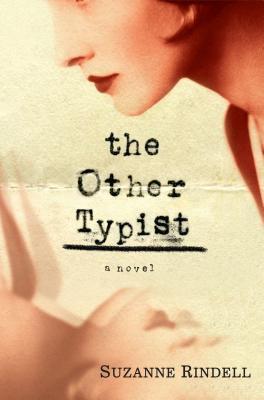
Anyway, here's an obvious one, given the title of the book itself. I had already seen Suzanne Rindell's book "The Other Typist" in bookstores nearby, but by the time I'd decided to purchase, nobody had it in stock.
So, I got onto www.bookworld.com.au and purchased this one instead. 


Even though I preferred the artwork of the other version...


picture courtesy of www.goodreads.com

...I figured I was buying the book primarily for its content rather than its packaging. The back cover of my copy shows review snippets done with further examples of typed font;


I'm looking forward to reading this book, too. Not so much for any mention of typewriters, although the first paragraph is very well written, with the opening line "They said the typewriter would unsex us", but because it's set in New York in the 1920s and I have a special fondness for that era between the Wars.

Next up is this collection of short stories by the late, great Patricia Highsmith.


Picture borrowed from http://www.panathinaeos.wordpress.com

This book was being weeded out from a library collection. I find it disheartening to see the work of an influential and talented writer removed from a library's database. Probably to make room for the latest Dan Brown or 100 Shades of Grey.
Anyway, the book I have is called Nothing That Meets The Eye.


I like the layout of this cover with its 'hand-written-with-paintbrush' author's name. Those of you who know your typewriters would recognise the drawing of a Royal K series standard. Which I suppose has nothing to do with various photos of Ms Highsmith at her own typewriter, an Olympia SM model;


picture borrowed from  http://fromthebarrelhouse.com/tag/patricia-highsmith/ (a fantastic post showing various writers and their workspaces.)

It would appear to me that the two photos of Highsmith at her typewriter could have been taken ten years apart. Routine is the hallmark of a good and consistent writer, methinks. 

I sat down to watch "The Perks of Being a Wallflower"  a couple of weeks ago. It's a coming-of-age story about a kid named Charlie who goes to a new high school and meets Patrick, a senior, and his step-sister Sam (played by Emma Watson, who succeeds in distancing herself from the Hermione persona of the Harry Potter films)  who nurture and show him how to live life rather than watch it go by. 
Later in the film, Sam gives Charlie a vintage typewriter for Christmas. It's a 1920s Royal Portable and he uses it to write letters to an unseen person. The title artwork of the film's poster shows a font from a fairly worn typewriter ribbon, which we assume is the vintage Royal;


And a closer inspection shows how the same letters print out  differently (due to varying levels of ink on the ribbon, I imagine), which I thought was a nice touch. Notice the lower-case 'l', for example;


While I'm not part of the demographic that this film is aimed at, I thought it a thoughtful and well-made film.

Next one is odd;


I tore this off a box of Weet-Bix Bites, my kids' current favourite breakfast cereal. Don't ask me what a typewriter font is doing explaining all the wholesome goodness of this stuff. Perhaps it's there to lend literary gravitas to statements such as 'a great fruity taste' or 'infused with wild berry pieces'. 
Or maybe this cereal is being pitched to typospherians.

Finally, this last one's a bit of a cheat. Whenever you look at books on writing, and screenwriting in particular, you are bound to find a typewriter or courier font in the artwork sooner or later. This title's layout mimics another rather worn-out typewriter ribbon;


And this motif is continued on the back page;


As long as there are books published about the craft of writing, there will be typewriter fonts used to help lend literary authenticity. 
At least until the typewriter generation dies out completely and we start seeing book covers showing computer screens and associated true-type fonts instead.
Right now, however, it makes sense to show typewritten font on the cover of a short story collection by Dashiell Hammett or Roald Dahl since we know that they themselves used typewriters to write these stories. 
It won't work so well the works of authors who began writing in the computer age.

Thanks for reading!

Monday, 13 January 2014

New Year. Time For A New Banner.

When I first started this blog, I wanted an eye-catching picture at the top of the page. Given the title of this blog, with it's Ludlumesque (in my view) overtones, I wanted a picture that reminded me of those classic airport-thriller book covers that I bought in the Seventies and Eighties;

picture courtesy of www.existentialennui.com
pic courtesy of www.doubleosection.blogspot.com

picture courtesy of www.bearalley.blogspot.com.au
(I almost called this blog "The Teeritz Protocol"  when I first set it up, but felt that Agenda seemed like the better choice of wording.)

However, I wanted the picture to reflect as many of my interests as I could cram into the frame, while still leaving room for the blog title to appear. And, since I would be using a bold, upper-case block font, I didn't want to obscure the title.
So, I spent quite some time arranging the items in the photo so that they would not obscure the text when viewed on a computer screen.

This here picture was my first attempt;


It worked well-enough, I suppose, and it showed a neat little mix of my wristwatches (my main love), a short snippet of my Bond fan-fiction, and a fountain pen and corner of a typewriter. This seemed to reflect what I was into when I first started this blog.

This picture was okay for a while, but I wasn't crazy about using a manila folder for the background because a corner of the table was visible underneath. My wife liked this banner picture and was surprised when I decided to change it.
The next photo would be a little more ambitious. A few more items strategically arranged, but still needing to keep a percentage of the frame blank for where the blog title would appear. And, since I'd just recently purchased a new camera with some interesting filter software in it, I decided to have a play around and see what I could come up with;


Sure, it was okay, but it always seemed a little too wide for my liking. I wanted it to look a little more widescreen to subliminally reflect my interest in film. And, to mimic the cover-art of the vintage Ian Fleming hardbacks of the '50s and '60s...


...I wanted the photo to look a little more like a water-colour or trompe l'oeil-style painting like the Bond book art painted by the legendary Richard Chopping. 
I was reasonably happy with the end result, but something about it always niggled at me. Maybe it looked to me like there was too much dead space in the frame. 
Although, I have to say it looked pretty neat seeing it through Google Translate;

German

Japanese (very anime)

Russian (ahh, yes, The Cold War)

And so, over the past couple of days, I thought about re-doing the banner. It's was as good an idea as any, I suppose, and I may switch it back to the old photo anyway if I tire of this one. 
I still wanted the picture to reflect the things I'm into, but I couldn't find a way to add some of my own creative writing. Looking back, I should have typed up half a page of a screenplay and left it sticking out of the Royal QDL. Ah, well...
Still, the watches are well represented, as are the books. I'm into classic American crime fiction and you would all know by now that I'm a Bond fan. The auto-focus was set to capture the Omega planet Ocean dive watch and the book spines clearly enough. The Persol sunglasses were thrown in to provide some more contrast against all of the warm tones. Looking at it now, some psychoanalyst would say that it would "signify your wish to remain anonymous on the internet, Herr Teeritz." Perhaps. I suppose this is why you'll not see any detailed pics of me or my family on this blog.

There's enough of the Royal QDL visible for even a novice to recognise it as a typewriter. I chose the Royal because it has a real typewriter look to it. To my mind, anyway. And it was a scorching hot day yesterday when I took the photos, so this provided a glow through the venetian blinds. Man, when we move to our next house, I'm gonna have to install wooden venetians first thing. They're so photogenic.

Lord knows, I have numerous versions of this photo, plus others that I took, to choose from;

The picture below shows the same effect as what's been up for the past year. I chose not to use a picture with a camera in it since I don't consider my photographic skills to be sufficient, and I don't want to confuse any readers who may stumble across this blog thinking that it's a photographic blog.


Soft-focus effect for that old Hollywood look.


Black and white to make it look like some kind of surveillance photo.


Again, if I decide to change the banner picture, I'll have to crop the replacement so that it's narrower than these.
Anyway, this seemed like a pleasant way to while away an hour or so as the temperature climbs to 43 degrees Celsius.
Man, it's hot! Sorry, I know that many of you out there are currently struggling through Winter, but man, it's hot here in my town today! 

Thanks for reading, and looking, all!

Thursday, 26 September 2013

Typewriter Fonts Are Everywhere.

Earlier this year, I wrote about a typewriter font that I noticed on the logo of a brand of shoes that I'd bought;

Serendipity In The Typosphere- Sometimes, There's No Escaping Typewriters

Since then, my font radar has sharpened a little and I've  noticed how prevalent the use of typewriter font lettering has become in recent years. However, it's been in use for quite some time.
May as well start with the earliest examples from my recent (and passive) findings from my DVD collection;

 
The poster artwork for "Erin Brockovich" (Dir: Steven Soderbergh, 2000) shows a well-worn typewriter font in its layout. I can only assume that it's used in order to tie in with the files and paperwork that Brockovich reads through in her attempts to expose the cover-up that this excellent film deals with. Soderbergh has stated recently that he plans to give up directing film soon because he's sick of the politics and bullshit that goes with trying to get a movie off the ground. It's a huge shame because he's one of the most gifted directors of his generation. Good news is that he's since stated that he's taking 'a hiatus' from film-making to concentrate on painting. Hopefully, he'll be back on a film set soon.
It would be great if HBO decided to make another mini-series based on a noir crime novel, like they did with "Mildred Pierce" a couple of years ago, and got Soderbergh to direct.
I'm allowed to dream, ain't I?
 
The next two films I noticed, along with the rest of the Typosphere, are a little bit of a cheat since typewriters figure so prominently in the storylines of these films. I only include them because;
 
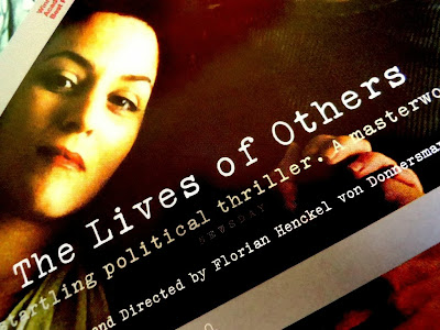
"The Lives of Others" (Dir; Florian Henkel von Donnersmarck, 2006.) shows a font that's meant to look like it's from a newer typewriter...


...or rather, one that doesn't have typeslugs worn down by decades of use. Even though the Groma Kolibri used in the film would date back to the late 1950s, while the film itself is set around 25 years later in the early to mid 1980s.

Well, they actually do look a little worn.


While in "Atonement" (Dir: Joe Wright, 2007);


The font mimics a typewriter ribbon that has been heavily used. Of course, we know in the first five minutes of the film that the typing is done by Briony Tallis (brilliantly played by Saoirse Ronan), a thirteen year-old girl with aspirations of becoming a writer, who taps away at a gorgeous Corona 4 throughout the first third of the film.
 
Typewriter fonts also show up in some unlikely places. I picked up a copy of Alistair MacLean's book, "The Golden Rendezvous". This edition was printed in 2008;
 
 
And it clearly shows another worn typewriter font used on both front and back cover. I'm not sure of its relevance to the story, since there's no mention of typewriters or official and/or bureaucratic paperwork in this tale, but I suppose it's used as a reminder of the golden age of MacLean's output throughout the Sixties.


A more obvious use of typewriter font on book covers tends to occur with texts on screenwriting. I have a tonne of books on the art and craft of screenplay writing, but I've noticed that, while many of these books will use modern Courier lettering for some of the cover text, it's usually the books that concern themselves with the history of screenwriting that utilise an old typewriter font as part of the cover art;
 
 
You couldn't not use typewriter font with a title (and photo) like that. Again, in covering the history of screenwriting, it seemed only fitting to use a worn font. I have yet to read this book and I hope the pages in between are as good as the cover.
 
One surprising use of typewriter font comes, of all places, from a women's fashion magazine. Sure, publications such as Vogue or Elle will sometimes use a typewriter-styled font when doing a fashion spread featuring 1940s inspired outfits where the model is meant to look like some old Hollywood star on a film lot, complete with security guards at the gate, set carpenters and huge arc lights in the background. Usually, the fashion spread will be titled something like 'Lights, Camera, Action! - The Glamour of Yesteryear's Hollywood Makes A Welcome Return' or something like that.
The magazine that uses typewriter font for its title logo is called 'Allure';
 
 
The issue above is from December 2011 and the current issues still use this font. Definitely meant to look typewritten. Kudos to them.
 
And finally, there's a new chain of stationery stores that have opened up in Australia in the last couple of years. The stores are called 'Typo' and much of their products feature their logo on them;
 
 
Again, it's meant to look like a faded typewriter ribbon. Pity they don't actually sell typewriter ribbons.
 
And there you have it. I'm sure if I looked around a little more, I could probably find further examples of typewriter fonts seeping their way into various areas of these modern times. But, I have three assignments due by the end of October and I probably shouldn't even be doing blog posts right now.
 
Thanks for reading!

Friday, 19 July 2013

Another Wristwatch Advertisement That I...uh...Ruined. Such Fun!

Here's the original classic Rolex wristwatch ad that appeared in magazines in the mid 1960s.


The Rolex Explorer (Reference 1016) was long pitched at those who led a more adventurous lifestyle than your Average Joe. Rugged, water-resistant and supremely legible, the Explorer became a classic for the Rolex Brand.

I was doing some handy-man crap around the front yard while wearing my Omega Railmaster and this magazine ad popped into my head.

"Hey honey, can you get my camera?", I called out to my ultra-patient wife.

And here's the result;


And here it is in glorious black and white;


The white text gets a little lost, but I tried every other colour in the spectrum and white seemed to work best. And it's a little more legible in the colour version.

Okay, now I'm hungry. 2:05pm. Yep, past lunchtime.

Thanks for reading, all!

Monday, 18 March 2013

Goin' to bat for The Typewriter Guy...not that he needs our help.


 "You know? For kids!"*


Yes, it was an absolute pain in the ass trying to write a screenplay on a typewriter, but what a buzz when it was finished! And I'd only written one page!


See that funny thing above? It's made out of something called steel. They used to make cars out of it.


I took one of my typewriters out in public once, while my daughter practiced her roller-blading. However, I typed away in a quiet industrial car-park 'cos I just knew this town wasn't ready to see a typewriter. God, no!


Ahh, if only we could. Allow people to do what they want, as long as it doesn't hurt anybody else.
 
 
Thanks for reading, all!
 
 
***typecast on a circa 1951 Olympia SM2***
 
 
*If you've never seen it, check out "The Hudsucker Proxy" (Dir: Joel Coen, 1994). Brilliant film. WARNING- It's got typewriters in it.