Showing posts with label Clothing and Accessories. Show all posts

Tuesday, 4 January 2022

My Most-Worn Wristwatches of 2021

Wednesday, January 5th, 2022 - 1:57pm AEDT

                                                                         Okay, so 2021 is over, and it's time for my annual write-up on the wristwatches that spent the most time on my wrist throughout the year. Turns out that I wore a watch 368 times last year. Which means every day of the year plus a few swaps throughout the day on a few occasions. 

Rather than just another collection of photos of the Top Eight Watches of the year, I've also included some other items in each photo. Turns out I have a few other collections. 
My way of thinking is that if I have three or four of a particular thing, it's a collection. Socks  and underwear don't count.

Anyway, let's get started. In the Number One spot was a watch that I knew would gain the top spot, but I was staggered by how often I wore it last year.

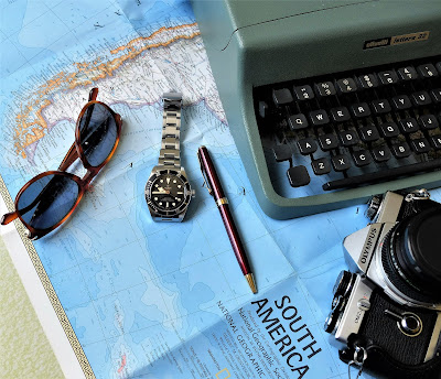
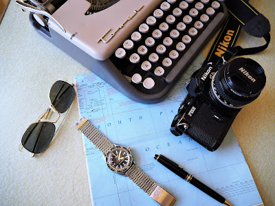
No. 1 - Tudor Black Bay 58

I wore this watch on 115 days in 2021. A landslide. It's not a perfect fit on my wrist. The clasp bridge section is quite long and its curvature doesn't follow the curve of my 6.5 inch wrist, but this is a minor quibble. What this watch does right, it does very right. I'm tempted to put it on a leather strap over Summer, to give it a little more wear and tear, but for now, I'll leave it on its bracelet.                                  For me, this watch represents what the Rolex Submariner dive watch used to be, up until around 2010 when they made some major changes to the case design.

One of my Instagram followers, @libations_and_explorations, summed it up nicely;

In my opinion, the Tudor Black Bay is the real Rolex Submariner of today. It is high quality, expensive, useable, but not insultingly overpriced either.

I agree. Don't let the word 'expensive' throw you off. In this instance, it's expensive because it's extremely well made, and you get what you pay for. 

Also in the frame;  

Camera - early '80s Olympus OM2n - I had one of these back in the early '80s and I stupidly sold it to fund the cost of repairing a Polaroid SX-70 Land camera. About five or six years ago, I got on eBay and bought this model. Then about a year later, I bought a spare because the price was dirt cheap.

Sunglasses - We were in Paris back in September 2016 and I wanted to buy something to commemorate the trip. These are Persol 649S (for small) Havana brown frames. 

Pen - a Parker Sonnet ballpoint. Got one off eBay and it began to fall apart about three months later. Took it to a pen store and they sent it off to Parker for repair under warranty. Turns out it was a fake! I was given the option to purchase a new one at a heavily discounted price, as a Goodwill gesture on their part. Suited me fine. Of course, they kept the fake. That was cool too.

Typewriter - my Olivetti Lettera 32 that I bought back in 1981. Hammered out a lot of book reports and assignments on this thing.

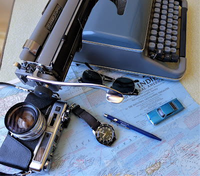
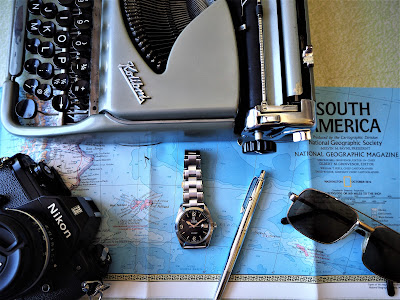
 No. 2 - ORIS Divers Sixty-Five

Worn 58 times last year, this one is a favourite. Slim case, perfect 40mm diameter, easy to read. And it's what watch collectors call a 'strap monster', which means that it tends to look good on just about any strap you put on it. This model, with the four sci-fi styled numerals on the dial, was discontinued a couple of years ago, which I think was a mistake. Sure, it's not everybody's cup of tea, but it's such a distinctive look. 

Link to my review from about three years ago;

Also in the frame; 

Camera - 1970s Yashica GSN Electro 35. I loved the retro look of this large rangefinder camera. I think I've only run one or two rolls of film through this thing and the results were nice. 

Sunglasses - The classic RayBan Clubmaster frames. These frames have quite a few screws holding them together, so it's wise to keep them in their case when they're not being worn. 

Pen - A Caran d'Ache 849 ballpoint. A gift from ORIS. A nice sturdy ballpoint pen with a one-piece barrel. You have to unscrew the push-button at the top in order to replace the refills. 

Typewriter - My son sent me a photo of this Blue Bird typewriter one afternoon after spotting it at a Thrift Store; "Forty-five dollars. Do you want it?'' 
''Sure!", I replied. 
It types nicely, although some of the keys are beginning to lift. Has a similar look to my Olympias.

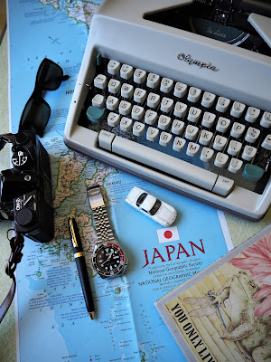
 No. 3 - Seiko SKX009K

I got this one in late September and it clocked up 27 days on my wrist. This is one of Seiko's most well-known designs, having been in production from around 1996 until a couple of years ago. The black-dialed version is the SKX007, but I opted for the deep blue dialed model instead, with the blue and red bezel. I figured my collection had enough black dive watches in it. 
This is the 009K, which means that it was assembled at Seiko's plant in Malaysia rather than Japan. If you want the Japanese version, look for a 009J. These are still reasonably easy to get. The surest tell-tale difference is that the Japanese-assembled models will have ''21 Jewels'' printed on the dial. 
Mine came with a rubber strap, which I promptly removed and replaced with the metal bracelet that I got about ten years ago for another Seiko watch which I have since sold. 
This is one of those watches that I used to see back in the '90s on the wrists of middle-aged surfer dude types that would frequent a cafe/bistro that I used to work at.
Seiko models in this price range ($100 to $600AUD) are known for their 'leisurely' timekeeping, but I have to say that this one seems to be keeping pretty good time throughout the day. Another reason why I opted for one of these was because it features a day and date window. I dunno about you, but I get those days after a public holiday or long weekend  where I go in to work on a Tuesday and it feels like a Monday. Throws my whole week out of whack. By Friday, I don't know what day it is. 

Also in the frame;

Camera - Another Olympus OM2n, but this is the all-black bodied version, which is what I had back in the early '80s. 
 
Sunglasses - a pair of Persol 2679-S frames that I got about fifteen years ago. Beautifully made. Their design is not currently in fashion, but no big deal. Everything comes around again, and these are a classic narrow frame that look like they could have been made in 1962, 1992 or 2012. 
 
Pen - a Shaeffer ballpoint that I think I got as a swap with my boss at work. Can't remember what I gave him. 
 
Typewriter - Olympia SM9 from late 1966. This thing seems to have been barely used by its previous owner, or they really looked after it. Writes like a dream.

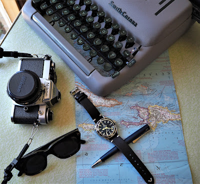
 No. 4 - Omega Planet Ocean 1st Generation

This one is a favourite, and it was worn over 21 separate days of 2021. As I have so many leather straps scattered around, I figured I may as well get some wear out of them. Ideally, though, I should probably wear leather straps through the Winter months when A) there's less chance of them getting wet, and B) less risk of them wearing out through exposure to perspiration. 
The Planet Ocean series has seen a few iterations since it was first released in 2005, but I think Omega got it right the first time. This 42mm version was sported by Daniel Craig in his second Bond outing Quantum of Solace in 2008. I got mine in 2006, as a gift from Omega for selling the highest number of their watches during a three-month sales period. Nice to know that, for once, Bond copied me!

Also in the frame;

Camera - a Nikon FE, produced during the brand's Golden Age, when they released one fantastic camera after another, throughout the 1970s. This one needs to be serviced, as the film advance lever doesn't lock when you wind on to the next frame. Aside from that, it works like a charm.

Sunglasses - Tom Ford 'Snowdon' frames. My wife got these for me about eight years ago off eBay for $20 bucks! Then, Daniel Craig wore the same frames in SPECTRE in 2015. Once again, OO7 took a leaf out of my book. These frames have a very '1960s' look to them. 

Pen - a Lamy Studio ballpoint. This has a twist action to expose the point of the refill, which is not my favourite type of pen. I prefer a push-button, as it can be used one-handed. Back in my two decades of working in restaurants, I got used to having a pen in one hand and a notebook in the other, which made for a smoother and quicker method for taking orders at table. 
Having said that, this is a nice pen to use, with a lovely weight to it. 

Typewriter - a circa 1956 Smith-Corona Silent Super. This brand made some great typewriters in the '40s and '50s, and this is one of their classics. Nice snappy action to the keys and type-slugs as they hit the page.

 No. 5 - Omega Seamaster 300 WatchCo Edition

Right behind the Planet Ocean was this watch, which I wore over 20 different days last year. Omega put its own spin on the dive watch back in the late 1950s and this iteration, which dates back to 1964 represents, for me anyway, the pinnacle of their dive watch design aesthetic. I've often said on watch forums that Omega should have kept this watch in uninterrupted production, with just some minor changes over the years, to allow for improvements in technologies and materials, etc. 
There's a reason why the Rolex Submariner dive watch has attained such a classic status over the years. Rolex are known to be slow in making changes and this resulted in a dive watch that stayed on the market virtually unchanged for decades, thus becoming an iconic wristwatch that is found in almost any Top Ten List of the best watches ever made. 
In my view, Omega could have achieved a similar result if they kept this watch going through the decades. 

Also in the frame;

Camera - the Nikon FM2, another classic of theirs. This one may need servicing also, but it seems to work okay, although I think the internal light metering seems a tad sensitive. 

Sunglasses - Randolph Engineering Aviator frames that I bought about fifteen years ago. These are a spare pair that I keep in my work bag.

Pen - Mont Blanc MeisterStuck 146 ballpoint. This is a reconditioned pen that I got a couple of years ago. As with any ballpoint pen, they are only as good as the refill inside them, in my humble opinion, and this pen does write very nicely. 

Typewriter - the late 1950s Tower Chieftain III, which is a Smith-Corona Skyriter rebranded for Sears Department Stores back in the day. A nice machine to use, and very compact too.

No. 6 - Tudor Ranger

This one was worn 19 times last year. It came out of nowhere late in 2020. It was offered to me at a good price and I found it difficult to say no. The previous owner told me that he had it serviced once during the time that he owned it. I had it checked out after I got it and the original rotor was replaced with a generic ETA rotor. No biggie. 
This watch was based on the Rolex Explorer model. Tudor watches were made by Rolex and they used ETA movements in them instead of in-house Rolex movements. As such, they were lower-priced and aimed at a wider customer demographic. The cases, winding crowns and bracelets were made by Rolex, but the movements were outsourced. This watch measures 34mm in diameter, which is as small as I tend to go with watches. This one has certainly led a life, as can be seen by the condition of the dial and hands. It's had some water-entry at some stage and I'm sure that it's due for another service. Something that I'll get around to at some point. 

Also in the frame;

Camera - Nikon EM from late '70s/early '80s. I had one a few years ago, then sold it. This one was about $40 bucks on eBay. Body only. The lens was another $70. 

Pen - Fisher AG-7 Space Pen. I love the look and feel of this pen. It's very solidly built. I just wish the refills provided a smoother writing experience. Although, maybe that's the compromise for having a pen that writes at any angle. 

Sunglasses - Five bucks from a Thrift Store. There's something very "1970s helicopter pilot" about these frames. 

Typewriter - Circa 1958 Groma Kolibri. The smallest one I have. Just slightly taller than a box of matches. Writes nicely, if a little loud.

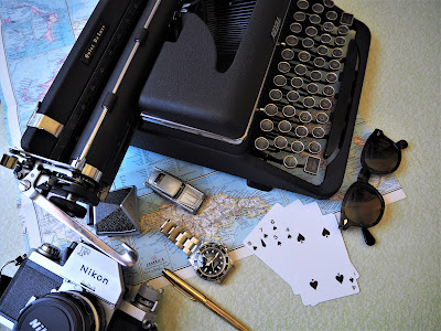
No. 7 (equal place) - Rolex Submariner 5513

A Bond watch. I wore it through 17 days last year. The Tudor Black Bay took some of the limelight away from this watch and I did give some serious consideration to selling this one. I spoke to the watchmaker I work with. He said hold on to it. I spoke to a watch dealer that I know. He said hold on to it. Even my wife said hold on to it. She added that I had wanted this watch for so long that it would be a shame to get rid of it. Then I put it on one morning and decided that I was foolish to even think of getting rid of it. I'll look at getting it serviced sometime in 2022, as I think it may be due for some attention. 

Also in the frame; 

Camera - a circa 1968 Nikon F Photomic. This thing weighs a tonne. I really should load it up with some film and give it a bash. 

Sunglasses - Moscot Lemtosh, in tortoiseshell. I got these in Bangkok in 2014. Great lenses, and they have a nice ''Sean Connery in From Russia With Love" vibe. 

Pen - a Parker 75 ballpoint in gold-plate. Nice pen to write with, but the clip is so flimsy. If you have it clipped inside a shirt pocket and you bend down to pick something up off the floor, the pen will slip out of your pocket. 

Typewriter - a circa 1947 Royal Quiet De Luxe. Sometimes, if you type too fast, it will join two words together, which can be annoying. It's an idiosyncrasy of this model. Well, it is a 70+ year-old machine. This is the model made prior to the Henry Dreyfuss revamped design of 1948.
Bond author Ian Fleming purchased a gold-plated version of the Dreyfus model to write his first book, Casino Royale.

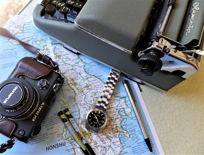
No. 7 (equal place) - Seiko SARB033

In equal 7th place, with 17 days on the wrist is this clean and clear dress piece. This one works nicely on its bracelet and it looks equally smart on a plain black leather strap. This would make a good all-purpose wristwatch. 100m water-resistance, a nice and neutral 38mm diameter, which would suit a wide variety of wrist sizes, this is a watch that punches well above its weight. This watch was discontinued a few years ago and has become quite sought-after since. 
 
Also in the frame; 
 
Camera - Olympus Pen F digital. This is a micro 4/3rds camera . I did a bit of research prior to buying it. In the end, the range of functions and its retro design won me over. It's been a great camera. 
 
Pen - a Lamy Logo ballpoint. Nice design, if a little flimsy. The clip came off once and an internal spring fell out. Took me a few minutes to put it all back together. A good pen, though. 
 
Typewriter -  a circa 1951 Olympia SM2. Writes like a dream. I think Olympia are my favourites. They are such rock-solid typewriters. 

No. 8 (equal place) - Omega Railmaster 36.2mm
 
I wore this one 15 days last year. It's a favourite. My one issue with it is the clasp. It's a design that dates back to the early 1990s and I'm not a fan of it. I've been thinking about maybe swapping it out with an Omega clasp from another model, but this will require some fine measuring and some possible filing down of components to ensure that they fit. Might be a bigger job than I can handle. At the moment, the watch is on a Forstner flat-link bracelet, which suits it nicely, but it's a lightweight bracelet compared to the Omega original. 
 
 
And, if you want to read the review I wrote of this watch eight years ago;
 

Also in the frame;

Sunglasses - RayBan Wayfarers in tortoiseshell. I bought them in 1986, at the height of the Wayfarer craze, thanks to Tom Cruise popularising them in Risky Business in 1983. He wore the black frames, and everyone I knew was buying them. I opted for tortoiseshell. I have another pair of them somewhere, as well as a pair with prescription lenses in my car. 

Pen - Aurora 98 ballpoint pen. This was sent to me by relatives in Italy back in the mid-Seventies and it stayed in its box for almost forty years before I started using it. 

Typewriter - a circa 1953 Olivetti Studio. I love the entire look of this machine, but man, is it loud! This one will probably go at some point.

No. 8 (equal place) - Omega Speedmaster Professional 
 
As with the Railmaster, this watch was also worn on fifteen days in 2021. A classic 1960s chronograph design, which has been virtually unchanged for over 60 years, this watch deserves its place in wristwatch history, irrespective of the fact that it was also the Moonwatch, wore by the astronauts of the Apollo 11 mission in 1969. 
These days, it has its detractors, who lament the lack of sapphire crystal, the 50m water-resistance, and the fact that it houses a hand-wound movement, but for me, this is all part of its charm. 

Also in the frame; 

Camera - a plain and simple Olympus Trip 35 rangefinder. In production from 1967 till 1984, probably a few of these were used by spectators during the Apollo 11 astronaut's ticker-tape parade upon their return from their historic moon landing. Simple to use, just point and shoot, and it produces a very atmospheric photo. 

Sunglasses - the other pilot's-style frame, similar to the Randolph Engineering model, these ones are made by American Optical. Slightly larger than the Randolph's, and the main difference is that these have plastic lenses rather than glass. 

Typewriter - a 1960s Olivetti Lettera 22, which I bought recently. Not sure why, to be honest, as I'm in the mind-set of trying to thin out my typewriters rather than adding to them.

And that's it. The ten watches that got the most wear throughout the year. This is a good exercise, no matter what collection you might have, because it provides a broad view of what gets used the most, which may in turn help one to determine one's preferences. 

I've come to realise that I like the all-round dependability and practicality of a dive watch. Aside from dive watches, I tend to like the simplicity of a Field or Expedition watch. Basically, a black dial with a few numerals on it, with bold hands to contrast against it. 

I have to say that my vintage pieces barely got a look-in this year. Some of them require servicing, so that might explain it to an extent. I think, though, I was still in a long honeymoon phase with the Tudor Black Bay. 

Anyway, that's how it all stands. I've been wearing the Seiko SKX009 since New Year's Eve. As it has a day and date function, it's been handy. You know how the days blur a little in the first week or two of January? Or maybe that's just me. 

Thanks for reading, and stay safe!

Monday, 6 July 2020

Monday, July 6th, 2020 - Reading From A to Z, French Rolling Pins, Updated Blog Banners + Recent Wristwatches


Customer or store details go on the left. Symptoms or issue with the watch go over on the right. I switch between different pens to provide a little contrast between each enquiry.

Private customers can be tricky at times because they can take a while to get back to me with a decision. Two or three months can go by. Then eventually, they call back and expect that I'll remember the details of the original conversation. Which is why I hold on to these pages for a few months. If somebody calls me back four or six months later, we start from scratch. Occasionally, a customer will get ticked off by the fact that I don't recall the conversation and I then remind them that I deal with a lot of enquiries on a daily basis and that the notes that I keep are held on to for only so long. 
They usually see the sense in that. 
Some of this info is cross-referenced into my daily planner, but generally, it's all written down in these A4-sized notebooks. Once full, they get numbered and stored in my desk drawer and held for about six months. After that, they are shredded. 
This system works well for me, as I've always been able to locate an old enquiry.

Here's a pic of the fiction bookshelf;


I've decided that it may be an idea to actually start reading these, beginning at the beginning of the alphabet. The idea is to read and release a few of these books that I've had for years. Something tells me that, once I've read some of these, I may not ever read them again, so it would be wise to then move them along.

The red book on top is a bunch of John Cheever's short stories. Ain't finished that one. I tend to dip into short story collections a little at a time. I've read some of the Carver short stories, but that was back around 1990, so I'm probably due to take another crack at them. I do recall liking what I read back then. 
The Plague by Albert Camus, not sure why I have that one, but I'm almost certain that it was a text that my brother had to read back in high school in the '70s. 
The thin red-spined book is Italo Calvino's If On A Winter's Night A Traveller. It could be a trippy read. 
I read Jaws back in the late 70s, after seeing Spielberg's film in '75. Been afraid of dark water ever since. 
The New York Trilogy could do with a re-read. 
Any Human Heart sounded interesting. It's about a fellow who...well, here's what the blurb on the back cover states;

                           William Boyd's masterful new novel tells, in a series of intimate journals, the story of Logan  Mountstuart - writer, lover, art dealer, spy - as he makes his often precarious way through the twentieth century.

That was pretty much enough to pique my interest. 

Of course, if I'm going alphabetical, Martin Amis is the first author to read.  The Information is about a struggling author who decides to ruin the reputation of a more successful rival. 
Another book of his, Night Train, is a thin novella (148 pages?) and I've started that one. It's about a female detective in Chicago (possibly) or San Francisco (maybe) who investigates a suicide where a young, promising and seemingly happy woman has shot herself three times in the head with a .22 calibre pistol. 
How somebody can manage that is what has kept me turning pages in this one. The story is told in first-person narrative (a favourite literary trope of mine, thanks Messrs Chandler and Hammett!) and the detective, with the rather improbable name (for a woman) of Mike Hoolihan is in her 40s, a liver-damaged reformed alcoholic who knew the woman and her family. The woman's father is ex-Chief of Police and he wants the truth.  
It's been described in one review as noir and Chandleresque, but I think that description's a little lazy on the part of the reviewer. It takes more than a first-person narration to make a book Chandleresque. The detective is darkly existential and quite downbeat, for one thing, and her voice-over does come across at times as stream of consciousness observations and musings. 
I'm probably wrong. I'm no book reviewer and I don't tend to 'read between the lines' when reading.
I'm on around page 80. If the book turns to crap, I won't mind so much, since it's so short.
Recently purchased was Martin Amis' father Kingsley Amis' first book, Lucky Jim. Figured it might be time to take a crack at that one.
Don't ask me why, but I recently bought a biography on Amis senior. It's 800 pages long! I would first have to plough through the three-volume biographies of Graham Greene by Norman Sherry. These total around 2,500 pages. By the time I'm done, I'll know Greene's life better than my own.
I though it would be interesting to read about these 20th century authors.

I finally got this watch back from repair;

It's the Tudor Oyster, a hand-wound model from around 1963. It was on my watchmaker's bench for almost two years. This was because he was waiting for a suitable window of time to work on it.
This is the watchmaker that I work with. He and I are busy enough dealing with the watches that come in for repair, so I knew that this job would take a while. The repair intake slowed down a couple of months ago thanks to COVID-19 and he was able to work on this watch. It needed a new mainspring, which he was unable to source for this calibre. He was confident that he had one in his collection of spare parts, but that would take considerable searching.
Meantime, I jumped on eBay and began a search for a ETA 1080 movement mainspring and ended up finding one after a few weeks. Once it was fitted to the movement, he tweaked the timekeeping a little and got it to a level that he was happy with. I have to say that the watch now winds as smooth as butter. Probably the only thing it needs now is some luminous paint on the hands. This is something that I may have done at some point by another watchmaker that I know.
This now leaves me with two watches currently under repair. One, a Lanco hand-wound model from the late 1950s, will most likely be sold once I get it back. The other is a Rado Golden Horse automatic and that one is in very good cosmetic condition, so I'll probably keep that one. It just needs a new winding crown and the watchmaker is having slight trouble getting hold of the correct one.

Just to note, my scanner has finally packed it in and I've therefore been taking photos of any handwritten or typecast pages. This is evident in the crappy lighting of the photographed pages.
Anyway, onwards!


And here it is. A French rolling pin. Tapered down to allow your fingers to curl around the ends a little more securely so that you have a little more control over it. Granted, it's just a damn rolling pin, and all you have to do is push it back and forth, but this makes for an easier-to-use implement. If the pin doesn't roll over whatever you are trying to flatten out, then there's the risk (especially with pasta dough) of tearing through the surface or bunching it up, which kind'a defeats the purpose of what a rolling pin is designed for.
It only took me about 2 and a half hours (!) and I somehow managed to skin a couple of my knuckles in the process, but at least it's done.
All that's left is some fine-adjustment sanding to smooth down a few bumps and then I may just dip the ends in varnish.
Not a perfect job, but that was the point. I rubbed some olive oil onto it prior to hanging it up. With anything like rolling pins and wooden chopping boards, the idea is to never submerge them in water, as this will mess with the composition of the timber. It's always suggested that you just wipe them down with a damp cloth and maybe rub them down from time to time with oil.
Tuesday, 23rd - 1st coat of varnish. Leather string removed from hook. Hook wrapped in masking tape. End of pin dipped in can of varnish. Excess brushed off.
Saturday, 27th - 2nd coat. Dipped into can and brushed off excess.
Sunday, 28th - 3rd coat. Final dip in can and excess brushed off.
Man, I can't believe the trouble I went to with this thing. I can't believe that I'm writing about it AND I can't believe that you're reading it, if you've gotten this far. This semi-lockdown/reduced workdays schtick must have gotten to me.
Anyway, both ends of this French rolling pin now look like this;

I was almost tempted to varnish further along the handle, in order to provide less friction when being used, but I figured it wasn't really necessary. The surface of the timber is sanded down smooth enough and a light coat of flour on the ends of the pin or on your hands will provide the required amount of 'slip'.
Besides, I spent way too much time (and money) on this endeavour.
And lately, I've been thinking about making a fountain pen stand, since I still have quite a few off-cuts of merbau timber lying around. That's right, a fountain pen stand. Something extremely useful in the 21st Century.


I wore the Omega Railmaster this month, seen here at a local Japanese cafe near where I work. I was going to order the beef bento box, but the place has been operating with limited staff since Covid-19 kicked in and they therefore offer a scaled down menu as a result. No matter. The chicken dish that I had was nice.

This pandemic has certainly knocked the hospitality industry for a loop. My son hasn't worked now since late March. His workplace (A local hotel with a restaurant offering pub meals*) has re-opened, but he tells me that they've had to give preference to staff who have been there longer than him. Still, he's been assured that he still has a job and once things get back closer to normal, he'll get some shifts.

*Pub meals - Australia certainly has its fair share of bars, but this country was built on pubs, or public houses. A lot of them were built back in the 1800s when English settlers began arriving in full swing and, to give you an idea, they probably resemble saloons like those you'd see in a western. Most, if not all of the older ones had rooms upstairs that were for rent, although I've never met anyone who's ever stayed in one. I think by the time I arrived on this Earth, these pubs were probably 80% vacant, with maybe a few rooms used as offices, staff change-rooms, and storage.

This pub here is The Albion Charles in Northcote. It looked a lot plainer back in the 1970s when I was a kid. My Father worked there briefly back then. In those days, liquor licencing laws dictated that pubs had to close at 6:00pm. This is where the phrase "the six o'clock swill" came from, as men would race into pubs after work to down a beer or three after finishing work at 5:00pm.
Back in those days, it was common for pubs to keep a tin box at the end of the bar. These boxes were usually about the size of four shoe boxes, and they were  filled with sawdust.
Some men back then just couldn't hold their liquor. Gave those pubs a very 'acrid' atmosphere. And slippery floors.

Tavern, Inn, Ale House. Here in Oz, they all mean the same thing- A pub.
About twenty or thirty years ago, a lot of pubs began serving a 'Pot & Parma'. Basically, a glass of beer and a veal parmigiana. I'm gonna assume that you all know what a glass of beer is. A Parmigiana (parmi-jahnah -I'm using phonetic spelling here, hepcats) is a pan-fried veal fillet which then has a slice of cheese draped over it and a ladle of Napoli (tomato-based) pasta sauce drizzled over the top of that.
Done properly, it's a nice meal. Even though I cringe at it being called a 'parma'. However, what really gets my goat is that classic pasta, Spaghetti Bolognese, often referred to as 'Spag Boll', or 'Spaghetti Bolognaise'.
It's not 'bollognayz', it's 'bollon-yeah-zeh' (say it fast). In Italian, when the letter 'n' follows a 'g', it's the same pronunciation as in 'lasagna'. To simplify it so that a nasty kid could understand it, it would be pronounced the same way as 'Nyah, nyah, nyah, nyah, naah!', but an Italian would spell it 'Gnah, gnah, gnah,gnah, naah!'

Anyway, Veal Parmigianas. Most pubs began to lift their game about fifteen or so years ago, as my town Melbourne (already the gastronomic capital of Australia) got even more food savvy. Pubs began to compete with more established eateries and the menus began to change.
Sure, most pubs will still offer a Pot & Parma, but you can bet your bottom dollar that a lot of them will serve it with rocket lettuce, kale or potato wedges drizzled with garlic oil and rosemary. Gone are the days of plain old French fries, with a greasy squeeze-bottle of tomato sauce (ketchup) on the table next to the napkin dispenser.
I'm taking the long way to get to my original point here. The place where my son works offers the kind of Pot & Parma meal that will consist of an upmarket brand of Aussie beer and an imaginative variation on the traditional P & P.
Yep, pubs have come a long way since the days of the six o'clock swill. 

You may have noticed that I changed my blog banner up above. Not entirely happy with it. I neglected to include some movie and music related items in the frame, and I also think the picture is too tall. I was aiming for more of a widescreen ratio. Not only that, but I was working against the clock, as the little amount of sunshine that I had available was diminishing quickly.
I'll take another crack at it soon.

I wore the Oris Divers SixtyFive. Here it is, hanging from the group handle of our coffee machine, which I took in to get serviced recently. We were without this machine for the longest two days of our lives.

I currently still have two watches under repair. The watchmaker is searching for a winding crown for one of them. I'm keeping an eye out on eBay, but I think it could take a while. 

Okay, so I changed my blog banner last week, to this;


I wasn't entirely happy with the placement of the objects in the frame. For one thing, I knew I had to leave some room along the top in order to fit the blog title. Secondly, I didn't include enough stuff which give a snapshot of the stuff that I'm into.
So, out came the props and the camera earlier today and I arranged it all on the kitchen table directly below the skylight. I decided to use some of the Art Filters on my camera.

Pop Art accentuates the colours;


Although, I still wanted to give it an artificial vibe. The 'Dramatic' setting was nice;


But a little harsh. And I wanted the wood-grain of the table to look a little lighter, in order to mimic the old hardcover Bond books of the 1950s.

Diorama was a nice setting. My wife liked this one best;


This setting blurs areas of the frame in order to make it look like a miniature model. Look at what this setting did to a nearby train station when I had the Olympus EPL-5;


You almost expect Thomas the Tank Engine to come chugging along. So, I was going to use this setting, but I didn't like that it blurred the titles of some of the books in the frame.

And so, despite my wife's preference for the Diorama setting, I decided on 'Key Line 1', which I had used on a previous banner years ago, and that's the banner that you see at the top of the page. This time, though, I decided to use the 'Paint' function in Microsoft Photos to write in the blog title, rather than using the Blogger template option. Reason being that I wanted to write the title in 'Cargo Crate' font, to link it further to the old Bond hardcovers.
And below that, I used a downloaded font called 'Underwood Quiet Tab' , for that well-worn typewriter font look.
The camera that I used was the Olympus Pen F, which was my replacement camera for the EPL-5.
The key line filter gives the photo an overall 'cartoony' look. Sure, the eye has to work a little harder to make some things out, but I liked the way the colours popped.
Probably the main areas where this photo suffers is the slice of lemon in the glass, whereby you can't see the texture of the fruit, and the Bond fan fiction page over on the far left. Still, I hope you get the gist.

Okay, another longer-than-expected post. Here are some of the other watches worn over the past month.

The circa 1996 Oris Big Crown Small Seconds Pointer Date.
This watch has gotten a surprising amount of wear since I got it.
Oris still produce the Big Crown model, which makes sense, since it's a design of theirs that dates back to 1938 and it has become a classic model in their catalogue.
Originally designed for pilots, the winding crown was oversized (hence the name) to allow them to set and wind the watch while wearing flight gloves.

Virtually every watch brand has at least one 'hero piece' in their history.
A hero piece is that one watch that is unmistakably their own and has achieved cult or classic status over the years. Omega has the Speedmaster Professional, the Moonwatch as worn by NASA astronauts. Rolex has several hero pieces, pretty much one watch from every range they have produced. Notably, the Submariner dive watch and the Daytona chronograph are the two models that are revered by watch collectors.

Brands that are no longer around also have that one watch that came along at the right time and became a classic. Take Enicar, for example. The brand went bust sometime in the 1970s, but they did produce the Sherpa Graph chronograph back in the 1960s and it is a collectable watch these days.
Eterna is another brand that produced a classic piece, the Kontiki, back in the late 1950s.
While these two brands may not have had the clout of the more well-known Swiss brands, they still produced at least one model during their time that could be considered a hero piece these days, based on how sought-after these models have become.

What else did I wear? Oh yeah, this one. The Omega Seamaster 300, seen here while I waited for lunch on a cold Winter's day recently. Just as well I wore my hat. The rail started pelting down as I walked back to my car.

I have three hats at the moment and I think I can maybe snag one more fedora and then get rid of one of my others. Storing these can be tricky. You either need to keep them in a hat box to preserve their shape or you store them somewhere in a wardrobe where they won't get pressed against other clothing. The idea is to keep the brim curved and/or folded as it should be. Hats can lose their shape pretty quickly if stored incorrectly. This can be solved by steaming the brim back to the desired shape, but access to steaming equipment can be- ...wait, what am I saying? I have a coffee machine. The steam wand will work fine. Although, if I can avoid having to steam the hat, then that's preferable.

And, while out to get some chore jackets at a nearby Uniqlo store, I wore the Submariner 5513. This Covid-19 era drags out processes that were once simple. I queued up outside the store for about ten minutes before they checked my temperature with one of those thermometer 'pistols' before letting me in.
I was there to buy a 'chore' jacket. These are usually an unstructured lightweight jacket with a few pockets. The kind of thing a carpenter would have worn sixty or seventy years ago. The pockets were designed to hold things like a pencil or tailor's chalk. This style of jacket has gotten popular in recent years.
I figured they'd be good for wearing around the house. Certainly came in handy on those mild early Winter days while I worked on that new bookshelf in the driveway. By the time I was done, the jacket smelled of sawdust. Like a carpenter from circa 1947.
Anyway, after wearing this one, I decided to head back to Uniqlo and buy a couple more of them. My wife thought I was nuts. At $49.95 each, they were hardly going to break the bank so, aside from this one in 'mushroom brown', I got a dark blue one and a khaki green one as well. That ought to do me. For a while.
They're thin enough to wear over a shirt. I wouldn't wear it on a cold day, but if the weather's a little crisp, they do take the edge off a little.
And yeah, they have enough pockets, for things like tape measures, carpenter's pencils, and my glasses. They're a good jacket for those times when you need to run out on a quick errand.

And, speaking of errands, my car needs fuel. Time to shut this puppy down, as my buddy Lee used to say back in the early '90s when it was time to close his restaurant for the night.

I hope you're all coping well. Stay safe, and thanks for reading!

Thursday, 5 September 2019

Still Here, Still Busy - Part 2 | 10:11pm, Thursday, 5th September, 2019 - My Kingdom for a Shirt Pocket!

The Oris Diver SixtyFive (40mm, blue & black dial) got a lot of wear in recent months. Here it is, back in May,  in a restaurant while I awaited some calamari. It was a lacklustre meal, to be honest. Lightly (actually, too, too lightly) grilled, it was an entire tube of squid with cuts half-way through it. If you think that doesn't make any sense, then neither did the taste. 
And it wasn't very hot. Barely warm, in fact. Just as well it was on the company dime.  I was having a quick dinner before a work function where there wouldn't be any food. It was gonna be a long night. And it was.

The Rolex Submariner also got its fair share on the wrist. I took this pic for my Instagram and then felt like adding some text to accompany it;


Ritts glanced at his left wrist. The mixture of perspiration and grime between the bracelet links had produced an oily residue that left a stain on his skin. 
He glanced at his watch on the table. He’d been at the safe-house since 4:00am and Al-Waleed never showed. Nothing more to do for now. He’d try again tomorrow. Ritts took a deep breath before letting a sigh hiss through his teeth. He then picked up the pressed rose that the inn-keeper’s daughter had given him when he first walked in. The inn-keeper himself, upon seeing Ritts in this disheveled state, reached under the bar and produced the bottle of single-malt. Ritts could have kissed him. After the second glass, he caught a brief whiff of his own body odor as he reached forward to put the rose back on the table. He needed a shower. A dead rose couldn’t disguise that fact. But he needed a drink first. ‘These people are beautiful’, he thought to himself as he dropped fifty Dirham on the table before he reached for his wristwatch.

****************************************************

In my previous post, I mentioned a jacket that my wife had found for me in a thrift store (in Australia, we call them Op Shops, which is short for 'Opportunity Shop') and I put an asterisk at the end of the sentence;

                   My wife is always on the lookout for clothes for me whenever she visits an Op Shop. I never tend to have the same kind of luck whenever I visit them.

Like I said, I put an asterisk at the end of that sentence, with the intention of elaborating a little on the subject. 
And then I forgot to elaborate on the subject. 
Anyway, here I go... 

You see, I have this theory about men and women, and the kind of stuff that they donate to thrift stores, and the methods and thinking behind their respective donation strategies (if any). 

Let's talk about something such as a tailored jacket. You know, corporate-style cut and design, in a sober colour, made from a nice wool. Women may buy said jacket and wear it for an entire season. They'll look after it, get it dry-cleaned when required and then they might take it to a thrift store as soon as they've had it for a couple of years or it's style or cut has gone out of season or fashion. 

Men will buy a cheaper type of tailored jacket and wear it to death. Guys will sweat in the jacket, drape it over the back of a chair, leave it on when they get behind the wheel, rub a wet paper napkin across the sleeve to remove some spilled sauce, toss it on the end of the bed when they get home from work, etc. 
Basically, a guy won't look after his jacket. He'll keep it too long, won't look after it properly and he won't get it dry-cleaned. The back of it will be creased and misshapen from being crushed and stretched between his back and the driver's seat, it'll have that sheen across the shoulder from where the seat-belt has rubbed against it over time and the armpits will smell. 
AND THEN he'll donate it to a thrift store, rebuking his other half's protestations with something like; "What? It's still in good nick (condition). Somebody's gonna get themselves a bargain."

My wife has here own take on this. I'll let her explain it 'cos she's better at it;

Okay so....a few extra things to add. Tee is right. Men - not having been bombarded with the cultural expectation of being 'fashionable' or the peer/vanity expectation of 'looking good', are less concerned with the shallower aspects of clothing -  care, original style, and price. 

For them, if they wore a garment only a little bit, they confer a value to it that means when they are finished with it, logically someone else might want it and get a few wears out if it. It's sweet, really.

And I suppose it demonstrates that men are all about the utilitarian aspect of clothing, that it's fit for purpose whereas women are generally more concerned with the superficial aspect; is it in style or, horrors, out of style?
After all, it is said that women dress for other women.

But I also believe that when it comes to Op Shops there are two types of men's clothing; the first, as identified by Teeritz - the thrashed and trashed beloved item, donated only because it no longer fits, but with a genuine desire to pass on to the next lucky wearer an excellent piece of clothing that will stand him in good stead.

The second type is the one I bring home for Tee. New or near new, often with tags still on, and the crispness of fabric that has never been against a warm body. Why? It was the present (gift) bought for a male by a female partner/friend/relative, that was just NOT to the recipient's taste. 
Too floral, too patterned, too tight, too 'extra'. Luckily, Tee does not mind a pattern and is on the thinner side. But the racks are full of such clothing - all showing the thwarted attempts and hopeful expectations of womenfolk to get their men to be fashionable. 
Hence my 'luck' at Op Shops. I should also add that I am never restricted by size as it's sooo often misjudged by Op Shop staff. So I look through all sizes and at all kinds of items. There are always size and style mix-ups. 
A cool head, a keen eye and patience are all you need.

Yep. Thanks, hon!

Staying on the subject of clothing, I've lately been having a pretty hard time finding decent shirts with a breast pocket on them.
All I want is a cotton business shirt, with  button cuffs, a sharp collar, and a pocket, and it should ideally be a slim-cut shirt, as these are better suited to my thin build.
I'm trying to avoid a repeat of what I wrote about five years ago (my God, was it that long ago?);

"Oh My God, I'm Wearing a Dad Shirt!" | A Lesson in Dressing for My Body Type

In recent weeks, I've visited numerous menswear stores with rows and rows of shirts and not a damn one of them has a pocket. Unless I go for an 'Easy Iron' (read poly-cotton blend), which I refuse to do, since I find that poly-cotton doesn't 'breathe' like cotton does.


Okay, so I prefer a shirt with a pocket. I always carry a pen, while I'm sure that 99% of men these days don't, because they have their precious mobile phones for jotting down notes with their thumbs and stuff like that. And, from what I've seen when somebody sends in a watch with a hand-written note, legible handwriting is becoming a rare thing these days.
It's a particular shame when the note has been written by somebody who explains that they bought the watch for their 40th Birthday TEN years ago. Did they dictate this note to their five year-old kid?
'Cos that's how the writing looks.
But I digress.
Aside from wanting a shirt pocket for carrying a pen, I also wear glasses and the pocket comes in handy for those times when they're not on my face. Am I the only man in the world who wears glasses? Has everybody gotten laser eye surgery?

At one store, I asked the salesman (who was probably my age or older); Why don't shirts have pockets these days?
His reply? "Because they don't look good. They break up the lines of the front of the shirt."
Okay, I get that, but shirt pockets have been around for as long as I can remember.
"And also, nobody smokes anymore, so they don't need pockets", he added. 
Man, he wasn't presenting me with a very convincing argument. I left him to his duties and got the hell out of there.
Aside from pockets, I have a few other stipulations;

1) - a sharp collar. Don't ask me to name the exact style. I read about them all the time, but I couldn't tell the difference between a Spread and an English Spread, etc.
If pressed, I'd say a Forward Point, as this is the most classic collar style in my view.
Basically, something like what you see in this pic.
And I'd prefer them to have those thin sheathes underneath where I can put in my own collar stays. You know, those little plastic surfboard-shaped thingies that keep the collars from curling.
I had a small jar filled with them, but I bought three pairs of stainless steel ones some time ago and my plan is to get three or four more of them and then get rid of all the plastic ones. The plastic ones get misshapen in the wash if you forget to remove them prior to throwing the shirt in the wash. The collars need to look sharp. They're the first part of a shirt that somebody will notice when you walk in the room.
 
2) - Narrow sleeves. I saw a lot of shirts labelled as 'Classic Cut' or 'Contemporary Fit' and they had very billowy sleeves.
The sleeve you see here could definitely do with being about 25% narrower. In my desperation to find a shirt with a pocket, I found three full-cotton shirts at a nearby store and they had interesting patterns, POCKETS, and were a decent fit. They were a Medium size and, in hindsight, I should have probably gone for a Small, but I think these were all that they had left at the time. They're a little roomy around the neck. I read on a website that your collar sizing should allow you to get two fingers between the shirt and your neck when the top button is fastened. I think these have a little more space in them than that. No matter. I'll get some decent wear out of them.
Or maybe some lucky fella will snag them at an Op Shop sometime soon!

Anyway, the passive search continues, but it looks like I may end up going through one of these websites that does semi tailor-made shirts.

This Oris watch has gotten some regular wear lately. It's a model from circa 1995, based on an Oris watch that was first done in the late 1930s.
The Big Crown series was designed primarily for pilots, so that they could set the time and wind the watch while wearing gloves, hence the oversized winding crown.
The date consists of 31 numbers arranged counter-clockwise around the outer edge of the dial and that little crescent clicks over to each date at around midnight. Oris still makes a Big Crown model today and it's perhaps one of their more well-known pieces.
I tried it on a bracelet recently, but i have to say that it's a watch better suited to a strap. Give it  that vintage vibe.
This model is 36mm in diameter. I had originally bought the smaller 33mm model, but as soon as I tried it on, I knew that it was just too small, even for my school-girly wrist. My daughter saw it and said that she liked the 'aesthetic' of it. So, at the time of writing, it's being serviced and with a little luck, it should be ready in time for her 17th birthday in the third week of September.
So I suppose that's one more piece that will be leaving my collection. Which is good, as I continue to slowly whittle it down to a set of watches that get worn more often.

Another piece that will go soon is this one;

It's an early to mid 1970s (I think) Camy Club-Star. A nice hand-wound watch that was given to me by a watch forum member some years ago because he knew I liked vintage watches. He said I could have it for nothing, on the proviso that I don't sell it to make a profit on it.
That was a lovely gesture on his part and I wore the watch quite a bit over the years. It has a nice silver dial, with gold-plated hands and hour markers. I very nice colour combo.
However, in the interests of moving watches along, in order to replace them with those that I really want, this one is gonna go soon.
I speak to a guy from time to time who works at a jewellery store interstate and he too has an interest in vintage watches. He's sent me a couple of old watches to have serviced. I told him that I had a watch that I don't wear much anymore and I thought he may be interested in it. He said he'd be happy to take it off my hands.
So, in the interests of paying it forward, good karma, and just doing something nice for somebody, I'll be sending it off to him soon. No charge, as per the gentleman's agreement that was made when I first received the watch.
At some point, though, I'd like to get something with a similar silver-and-gold colouring, but that's a daydream for another day. For now, let's just get some watches out the door first and we'll see where we're at when the dust settles. Have to say, though, that this Camy runs quite nicely. Winds nice and smooth and keeps fairly good time, though I'm sure it could do with a service.
Still, it's a nice piece. I hope he likes it.

My Bond hardcovers collection is progressing nicely.


They're all reprints, with the exception of the last two titles, The Man With The Golden Gun and Octopussy. These were Fleming's last two Bond novels and, as such, they were printed in large quantities, which makes them reasonably easier to find.
The ones I'm missing are Live And Let Die, Diamonds Are Forever, Moonraker and Dr No, but those titles, while nice, don't have the classic cover art by Richard Chopping.
So, I don't think I'll lose any sleep over not having them. Pictured in the frame also is the Omega Seamaster Planet Ocean, which saw some wear through May. I tend to get more wear out of this watch in Summer.
Here's hoping for a hot one this year.

Okay, I think I'll stop here for now. I added more, to this post, but it threatened to become a long one.

I'll start the next post this weekend and see where it leads me.

Hope you've all been well, and thanks for reading!

Wednesday, 1 July 2015

The Bond NATO Strap - As I Understand It.

Right, now pay attention. The new Bond film, SPECTRE, is just around the corner (okay, so the corner's still some distance away, but November will be here before we know it) and I thought I'd take a crack at writing about the watch straps that have appeared on OO7's wrist in the early Bond films, and the subsequent legacy, if you will, that these simple watch straps have created in the years since we first saw them appear in Goldfinger back in 1964. 

Okay, with that brief intro out of the way, those of you who are still interested, feel free to read on. 
As the post title would suggest, this is no definitive text on the subject, but merely represents my own thoughts and opinions on the matter and, as such, it shouldn't be read as gospel since there are sure to be some more thoroughly researched and informative articles on the web about this topic. 
Anyway, here goes.
About ten years ago, I got myself a couple of 'Bond' NATO straps off the web. They looked like this strap here (right).

Thanks to the wonders of VHS video, we could all now pause and rewind this Bond movie to our heart's content. The resurgence in popularity of James Bond in the late 1990s, thanks to the Brosnan films, and the release of the entire Bond movie back-catalogue on DVD, caused British GQ Magazine to commission the production of a strap and run a competition where it would give it away to some lucky readers. I'm not 100% certain, but this could have been the first of these black and grey NATO straps that were produced.

Whoa! Slow down, teeritz. Just what exactly is a NATO strap? 

Oh, yeah, okay. The British Ministry of Defence put out a tender back in the early 1970s for a watchstrap which could be easily fitted to any standard 20mm lugged, conventional watch case used by British Forces. The strap had to be cheap, it had to be durable, and it had to be strong.

There were other design stipulations mentioned in the MoD tender, to do with material required, length, thickness, etc. If you want to read the final report, here's the link;

H-SPOT.net- Ministry of Defence- Watchstraps-2001- pdf doc


And so, the NATO strap was born. Now, given that we can see that under-hanging piece in the drawing above, I should point out that this is perhaps the most crucial design aspect of these straps. When fitted to your watch, the strap should pass underneath the case, like so;


So, for us mere mortals, these spring-bars tend to work well enough. They are pretty sturdy and they can withstand quite a bit of pressure during day-to-day civilian activities.  Here's a spring-bar, if you need a refresher. This one proved a little stubborn to remove one day, but it was nothing that a steady hand and a Bosch drill couldn't handle;


In the event that one of the spring-bars should come off, the strap will still be secured to the watch by the bar on the other side.


Of course, watches intended for military use tended to dispense with using anything like a spring bar and you will often find that solid bars will have been soldered to the watch case to reduce the risk of the watch coming off the wrist. Here's a military-issued Rolex Submariner 5517 with soldered bars;


Anyway, that's a quick primer on NATO straps.
Now, once DVD came along, it appeared that the original Goldfinger NATO strap was not merely black and grey striped, but in fact black and khaki brown with a thin red stripe running in between.
Thanks to that close-up of Bond's watch in the classic pre-credits sequence of the film...


...we now had a better idea of the colours of the watch strap attached to his Rolex Submariner 6538.

Off-topic- notice how the strap is narrow compared to the 20mm spacing between the lugs? My theory is that somebody on-set had to rush out and get a strap that would fit Connery's wrist. I've often read that this particular Rolex belonged to the film's producer, Albert R. Broccoli. However, he has never struck me as a dive watch kind of guy. I read a long time ago that the watch actually belonged to one of the crew, who was ex-Royal Navy. That makes more sense. Now, rather than attempt to remove links from the watch's bracelet, it would be a simpler process to remove the bracelet entirely (since all you really need is a safety pin) and slip the NATO strap through the spring-bars and then away you go. This strap, however, looks to be around 16mm wide. These straps were available from corner news-stands back in the 1960s and, given that your regular urban gent probably wore a plain dress watch, the chances are pretty good that these news-stands only carried straps that were either 16 or 18mm wide. These sizes would fit most watches  available at the time.
At any rate, that's my theory as to why we see Connery's watch 'under-strapped' in both Goldfinger and Thunderball. Granted, it's all based on speculation, but nobody associated with these early Bond films has ever provided a definitive answer. So, I suppose my guess is as good as anybody's. Maybe.

Before too long, it was on for young and old, as we saw a plethora of internet dealers selling what they all claimed to be the one true Bond NATO strap. I saw this one here (right) on a website and promptly ordered one. Even though the colours weren't entirely correct.

Just one other problem. It was a ZULU strap, not a NATO one. The ZULU strap is of a slightly different construction to the NATO. The hardware is different, consisting of larger, curved rings stitched into a single strap of thicker-than-a-NATO nylon. I don't mind ZULU straps, but I find that they are better suited to watches larger than 42mm in diameter. The larger shape of the rings make these straps look beefier than their NATO cousins and they can overpower the look of a smaller 40mm watch. Just my opinion.

Then, just when we all thought that DVD Hi-Def had given us the true colours of these straps, along came BluRay and suddenly, the colours provided us by DVD seemed a little off. It wasn't khaki brown, it was more of an olive drab hue between the black stripes. Anyhow, some time passed before I ended up getting a couple more NATOs. They were cheap enough, after all. The one on the left in this photo had the same colouring as the ZULU strap above, but it had the slimmer hardware and a sleeker fit on one of my other dive watches. The one on the right of the frame was a more correct colour combination. Black and olive drab stripes, with a thin strip of red thrown in. All was well in the world of Bond fans wanting to emulate the Goldfinger wristwatch look.
So, by now we had a number of internet watch dealers selling these new and more colour-correct straps, all claiming that they were selling the accurate Bond NATO strap as seen in Goldfinger. 
Granted, most sellers were charging anywhere between $12.oo to $16.oo, which was reasonable enough, considering how long these straps can last. However, there were other companies out in the World Wide Web who were selling their versions for forty US dollars. 
I may be a die-hard Bond fan, but I ain't crazy.

Of course, with so much information available on the internet, we soon began to see photos of Bond that we had never seen before. Here's one of Connery on-set, between takes (one imagines) of the famous "No, Mr. Bond, I expect you to die!" scene in Goldfinger's secret lair;


Uh-oh, what have we here? That looks like a normal steel tang buckle. And what's that bit of fabric running across the strap? Is that a keeper?
So, it would seem that Bond did not wear a true NATO strap in the early films. It was just a plain nylon strap, similar in construction to a trouser belt. Of course, Connery couldn't have worn a NATO strap in Goldfinger in 1964 because the NATO strap was not commissioned by the British Ministry of Defence until the early 1970s, remember?
Suddenly, the small corner of the internet that cares about this stuff was, once again, in a flux. The company that was charging forty bucks for their straps brought out this new version. A bunch of other dealers commissioned the NATO strap manufacturer, Phoenix Straps in the UK, to produce this new, Bond-correct version. Me, sucker that I am, I just had to get one.

However, I didn't have BluRay, so I basically never got the memo about the true colours of Bond's strap. I found an eBay Seller and bought six of these straps (right). These are just one piece of nylon that threads underneath the case-back and has a keeper made from the same fabric. They fit great. But they're not exactly the right colours. Although, I don't mind them. They work very well on either the Submariner or my Omega Seamaster 300. And they were cheap enough at the time that I bought them. I think they were about eight bucks each. So, I didn't sweat it too much.
So now, we knew definitively that Bond didn't wear a NATO strap in Goldfinger. And, for me, all thoughts turned back to those news-stands of the '60s. I could just imagine a cheap plastic display case pinned up on the wall, next to packets of Players Navy Cut cigarettes and musk flavoured Life Savers, with a variety of cheap, multi-coloured nylon straps nestled within it. It made perfect sense to me. Back during my decade of selling watches, I had my fare share of customers who would walk in and say; "I'm on my way to a work meeting and my watch strap looks a little tatty. Have you got any replacement straps?" 
I would show them a range of generic leather straps that we had for just this type of situation. I could remove the customer's worn or broken strap and fit a new one onto their watch within two or three minutes. Even less if they were in a real hurry.

The last time I watched Thunderball, I again saw this 'under-strapped' Rolex Submariner;


Man, I hate that.  have seen some folks using the same sized strap on their own Submariners, in an effort to maintain authenticity. But I think that's going too far.

Sometime late last year, I got this strap (right). Based on all the screen-caps that I've seen over the last couple of years, this seems to be the closest match to what appeared in the films. Although, I'm reliably informed that the buckle is not exactly like Connery's. But by this stage, I've pretty much given up. I'll wait until I've worn out a few of these straps before I contemplate buying any more.


The beauty of these straps lies in their simplicity. Whether you opt for one of these Bond Nylon straps or a NATO/ZULU, they are easy to attach to your watch and make for a very comfortable fit.
If you wear them for a while and they get dirty, just throw them in the washing machine with the rest of your laundry. They'll come out looking new again.
The subject of NATO/Nylon straps comes up fairly regularly on wristwatch forums. Consensus is clearly divided on these straps. Many folks will argue that they can make a watch look cheap; "How can you put a cheap-assed nylon strap on a watch that costs thousands?", they argue.
My response is always the same; "A cheap-assed nylon strap is what holds you firmly in the driver's seat of a two hundred thousand dollar Ferrari."


The new Bond film, SPECTRE, will be released later this year. Among Bond nerds who are also into wristwatches, forum chatter always turns to second-guessing about what wristwatch OO7 will wear in the next film. First pics of location shooting began to appear on the Web a few months ago. www.007.com teased us with this image;


The fashionistas began to dissect Bond's outfit and sunglasses. The gun fans quickly identified OO7's choice of pistol (Heckler & Koch VP9, in case you're wondering).
We Bond/wristwatch nerds got straight to work on the watch.
Given the angle of his left wrist in this picture, there wasn't much to go on, but it was enough. The strap looked like a NATO, based on the strip of steel running across the band. Hard to tell what watch he was wearing, but the consensus was that it would either be a Seamaster Planet Ocean or the recently released Seamaster 300 Master Co-Axial. Both of these watches are made by Omega who, as you may know, have been supplying cinematic Bond's wristwatches since Goldeneye in 1995.

Other pictures soon began to emerge, and it was the photos from the Rome shoot that laid any strap speculation to rest. We still couldn't make out the model of wristwatch (although five'll get you ten that it'll be the new Seamaster 300), but the strap was clearly a NATO with a black and grey stripe running through it. Yep, that's right. Bond would be wearing a strap with the colours that we all thought were the ones on his watch in Goldfinger.
I can understand why Omega created this strap. These two colours are perhaps perfectly suited to the colouring of the watch itself, whether it be the Planet Ocean or the Seamaster 300.
Nevertheless, Omega have now created a watchband that will become part of film-Bond lore. A watchband in colours based on an error of perception, thanks to the low definition renderings of VHS. Bond's watch in SPECTRE will look something like this;


What a long, strange trip it's been. From the first few NATO straps that were readily available on the internet ten or fifteen years ago, through all the various shades of military browns and greens that were added, to the inclusion of the thin red line, we have now arrived back where we started. Now, I won't be rushing out to get a genuine Omega NATO strap. They're too rich for my blood. Especially when one can get something very similar for a fraction of the cost.
In all fairness to Omega, their straps are of a much nicer quality than the average fifteen dollar version. The nylon is a tighter weave, the feel is closer to the smoothness of a new car seat-belt, and the hardware is finished quite nicely too. So I guess that would explain the difference in pricing, and I'm sure that these straps will sell very well once the film is released.

At any rate, I'm all NATO'd up for the time being. With the Submariner, I can leave it on its steel bracelet, when I'm in a Live And Let Die kind of mood, or I can slip the what-is-now-known-as the TrueBond nylon strap through it if I have to plant some plastique explosives on some drums of fuel to blow up some illegal heroin in Cuba in 1964.

Although, given my exciting lifestyle, I'll probably be wearing them when I have to vacuum under the couch or put out the recycling bin every second Thursday.

Either way, I think I've got it covered.

I'll leave you all with one last picture, this one featuring international financier, Arpad Busson, who wears a nice vintage Rolex Submariner on a 'cheap-assed' NATO strap;

Yes. That works. That works very well indeed.


Thanks for reading!