Thursday, 26 September 2013

Typewriter Fonts Are Everywhere.

Earlier this year, I wrote about a typewriter font that I noticed on the logo of a brand of shoes that I'd bought;

Serendipity In The Typosphere- Sometimes, There's No Escaping Typewriters

Since then, my font radar has sharpened a little and I've  noticed how prevalent the use of typewriter font lettering has become in recent years. However, it's been in use for quite some time.
May as well start with the earliest examples from my recent (and passive) findings from my DVD collection;

 
The poster artwork for "Erin Brockovich" (Dir: Steven Soderbergh, 2000) shows a well-worn typewriter font in its layout. I can only assume that it's used in order to tie in with the files and paperwork that Brockovich reads through in her attempts to expose the cover-up that this excellent film deals with. Soderbergh has stated recently that he plans to give up directing film soon because he's sick of the politics and bullshit that goes with trying to get a movie off the ground. It's a huge shame because he's one of the most gifted directors of his generation. Good news is that he's since stated that he's taking 'a hiatus' from film-making to concentrate on painting. Hopefully, he'll be back on a film set soon.
It would be great if HBO decided to make another mini-series based on a noir crime novel, like they did with "Mildred Pierce" a couple of years ago, and got Soderbergh to direct.
I'm allowed to dream, ain't I?
 
The next two films I noticed, along with the rest of the Typosphere, are a little bit of a cheat since typewriters figure so prominently in the storylines of these films. I only include them because;
 
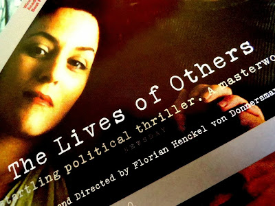
"The Lives of Others" (Dir; Florian Henkel von Donnersmarck, 2006.) shows a font that's meant to look like it's from a newer typewriter...


...or rather, one that doesn't have typeslugs worn down by decades of use. Even though the Groma Kolibri used in the film would date back to the late 1950s, while the film itself is set around 25 years later in the early to mid 1980s.

Well, they actually do look a little worn.


While in "Atonement" (Dir: Joe Wright, 2007);


The font mimics a typewriter ribbon that has been heavily used. Of course, we know in the first five minutes of the film that the typing is done by Briony Tallis (brilliantly played by Saoirse Ronan), a thirteen year-old girl with aspirations of becoming a writer, who taps away at a gorgeous Corona 4 throughout the first third of the film.
 
Typewriter fonts also show up in some unlikely places. I picked up a copy of Alistair MacLean's book, "The Golden Rendezvous". This edition was printed in 2008;
 
 
And it clearly shows another worn typewriter font used on both front and back cover. I'm not sure of its relevance to the story, since there's no mention of typewriters or official and/or bureaucratic paperwork in this tale, but I suppose it's used as a reminder of the golden age of MacLean's output throughout the Sixties.


A more obvious use of typewriter font on book covers tends to occur with texts on screenwriting. I have a tonne of books on the art and craft of screenplay writing, but I've noticed that, while many of these books will use modern Courier lettering for some of the cover text, it's usually the books that concern themselves with the history of screenwriting that utilise an old typewriter font as part of the cover art;
 
 
You couldn't not use typewriter font with a title (and photo) like that. Again, in covering the history of screenwriting, it seemed only fitting to use a worn font. I have yet to read this book and I hope the pages in between are as good as the cover.
 
One surprising use of typewriter font comes, of all places, from a women's fashion magazine. Sure, publications such as Vogue or Elle will sometimes use a typewriter-styled font when doing a fashion spread featuring 1940s inspired outfits where the model is meant to look like some old Hollywood star on a film lot, complete with security guards at the gate, set carpenters and huge arc lights in the background. Usually, the fashion spread will be titled something like 'Lights, Camera, Action! - The Glamour of Yesteryear's Hollywood Makes A Welcome Return' or something like that.
The magazine that uses typewriter font for its title logo is called 'Allure';
 
 
The issue above is from December 2011 and the current issues still use this font. Definitely meant to look typewritten. Kudos to them.
 
And finally, there's a new chain of stationery stores that have opened up in Australia in the last couple of years. The stores are called 'Typo' and much of their products feature their logo on them;
 
 
Again, it's meant to look like a faded typewriter ribbon. Pity they don't actually sell typewriter ribbons.
 
And there you have it. I'm sure if I looked around a little more, I could probably find further examples of typewriter fonts seeping their way into various areas of these modern times. But, I have three assignments due by the end of October and I probably shouldn't even be doing blog posts right now.
 
Thanks for reading!

The Other Typospherian With The Loose Spring On His Olivetti Studio 42- Could This Be The Answer?

 
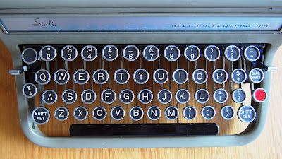
Further to my previous post about Davide's dilemma with his Studio 42, I thought I'd take a look at my own Olivetti Studio to see if I could be of help. 


This tiny little spring...


...seems to provide that tension that you feel when you lift up the paper bail bar that rests against the platen when you type.


Who would have guessed?

I hope this is of some help to you, Davide.

Tuesday, 24 September 2013

Another Typospherian with an Olivetti Studio 42-This One Has a Dislodged Spring.

After my last post about my latest acquisition, I received a comment from Davide, who has his own blog filled with typecasts.

http://www.theresnothingtosay.blogspot.it/

He also has a Studio 42, but his model has a small spring near the return lever which doesn't seem to be anchored to anything. I've had a look at his post;

Three new typers!

However, I'm not expert enough to know where this spring should go. Anybody out there who may have a better idea as to where it should fit?

Just spreading the typewriter love, folks.

Thanks for reading!

Sunday, 22 September 2013

The Typewriter Collection No. 14 - Olivetti Studio, Circa 1952


I'm not 100% sure, but I think this model dates back to around 1952, based on Ted's Serial Number Database.
When my wife saw this one, she said; "Oh, that looks nice. What is it, Sixties?"
"I think it's early 1950s, but it's a design from the late Thirties", I replied. It certainly does possess design elements from 1930s Remingtons to me.


The case was missing its handle, but I soon came up with something makeshift that'll do for the time being;


The keytops are in good condition. I took a toothpick and gently scraped around the inner edges of the metal rings to get rid of some built-up crud.


I popped the hood and was happy to find the original metal spools. After my Remette mistake, I've been a little cautious. And I do like how the ribbon cover lifts up like the bonnet of an Italian sports car. I was almost expecting to find a pool of oil underneath this typewriter afterwards.


The profile shot. A little bland-looking, but this strikes me as something designed to be a workhorse first, and a show-pony second. And, being a 1930s design, I can only speculate that Italy was doing it tough (again) and perhaps Olivetti was more concerned with solid build quality and no-nonsense aesthetics. Hmm, looks like I left an oily fingerprint on the side there.


The rear of the machine.


The ribbon colour indicator was filthy. The blue dot was recognisable, but the other two were a dirty grey, filled with dirt. I scraped it out and then painted them in with Liquid Paper. I scraped away the excess with an ice-cream stick and tried using a red fine-point marker. With limited results. I'll have to get hold of a Texta (Magic Marker) and have another shot at it. Unless I can convince my wife to let me use some of her red nail varnish. But the last time I did that, I spilled some on her best pair of stilettos.
Serves me right for wearing them, ha, ha!


And there you have it. While I was originally looking at Studio 42 models, this one will do just nicely, I think. When I picked it up from the seller and got back to my car, I placed the case in the back-seat and said to my kids; "I think I'm done with buying typewriters. I got enough of them now."

And I can't think of anything else that I really want. Collection's pretty solid and varied. I'm happy with how most of them type and the ones that don't type so flash are beautiful designs and worth keeping for that aspect alone.

My recent Olympia SF escapade showed me that sometimes, even if I want a typewriter for a particular reason, I should perhaps hold off on purchasing it because it may not write in a way or manner that I'd like. I've used enough of them over the past few years to know what I like from a typewriter in terms of feel, key tension, sound and overall design. Part of me still wants something like a Remington Rand KMC standard, but right now, I wouldn't know where to put the thing. And I did recently think about a Dreyfuss-designed Royal Quiet De Luxe from the late 1940s, but, while it may look different to my '47 QDL, it would probably type pretty much the same.

So, I think I'm happy with my Baker's Dozen + One collection at the moment. And I'm thinking that if I decide to go for something else, then I should get rid of something that I have. Fourteen typewriters are (barely) manageable for me and I think I'd like to keep it that way.

The only thing to do next is stock up on ribbons for these babies.
I'm kind'a partial to purple at the moment.


Thanks for reading!

Sunday, 15 September 2013

"Better To Travel Hopefully Than To Arrive"- My Folly With An Olympia SF.

I thought I'd borrow that line for the post title from "You Only Live Twice"* because it nicely sums up the 'reality not meeting expectation' that we've probably all experienced at least once in our lives, and it perfectly sums up this recent typewriter experience of mine.
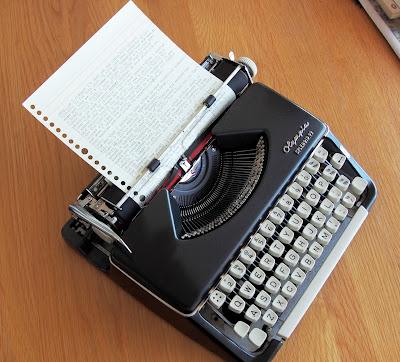
So you may have read of my missing out on a thrift store Olympia a few weeks ago. It looked a lot like this one, but it had no Splendid badging on it;

20130826-205835.jpg
picture courtesy of http://natslaptaps.wordpress.com (hope you don't mind, Nat!)


Okay, so I decided that I wanted an Olympia SF after seeing this picture of Ian Fleming using one at his home, Goldeneye, in Jamaica in the early '60s;

http://www.vorg.com/typers/Famous_Typers_Flemming.jpg

And that's just like the one that I got off eBay.

 
Looked great, especially after I took it apart and cleaned it. Wedged some sound-proofing into the sides of the case too.

 
And then, as a comparison, I sat down with my Splendid 99 and typed a little on that;


And noticed more than a little difference.


*I really hate relying on Google searches all the time because I'd like to think that I can sometimes find information via other means or within the recesses of my memory, but I read "You Only Live Twice" so long ago (1983?) that I felt it best to check the source of that quote. Turns out it was Robert Louis Stevenson who wrote it in "Virginibus Puerisque" in 1881.

Wednesday, 11 September 2013

Two Royal QDLs- One of Them's Gotta Go.

The real trick to collecting anything is not to get too attached to them. You never know when you might have to sell a few items of your collection in order to fund something else. Or, you may just look at your collection one day and realise that you have a few multiples of the same thing.
I looked at my collection of typewriters recently and decided that I had a few too many. So, two of them wound up on eBay and went off to good homes (I hope!). Since I use my typewriters for other writing besides typecasting, I decided that I only want to have machines that work well and do what they're supposed to. Of course, there are a couple of exceptions to this rule. My circa 1936 Smith-Corona Standard, 1939 Remette, and the 1928 Royal portable are rough typewriters to work on compared to the 1950s Olympia SMs and Smith-Corona Silent Super. However, these three Depression-era typewriters are so beautifully made that I just can't part with them.
There are, though, other typewriters I have that should be off-loaded from my collection. I just recently had a circa 1947 Royal Quiet De Luxe nicely restored by Tom at Elite Office Machines and it's now a great typewriter to use. Problem is, I already had one of the same model;


The model on the left is the one I bought a couple of years ago. It has its faults, but it's a beauty to write with. The one on the right was recently serviced and it types very nicely too, but the left one has the edge.


Here's a typing sample from the first QDL I bought a couple of years ago;


Dig that cool number '4' font! And here's a sample from the recently restored QDL;


Sure, the ribbon's not as strong as the other model, but still has plenty of life left in it.

Now, the crinkle-paint job differs a little on these two typewriters, too. Here's the first one;


And here's the second, which looks a little more well-worn;


However, for me, the greatest cosmetic difference lies in the actual keytops of these machines. The tops on the first one I bought are quite faded, making typing difficult in low lighting;


While the keytops on the newer model are sharper;


Some of you may have read of my recent attempts at changing out the faded keytops. This is a job that I plan to continue with at some point.


I can't help but think that the second QDL was perhaps used more extensively over its lifetime compared the first one I bought. Either way, as good as this one types, the temperamental model that I got two years ago is the one I would rather keep. I can live with its (minor) faults.
And here's the set-up I used to write this post.


Pretty Zen, but it was murder on my lower back after fifteen minutes. As my wife sometimes says to me; "You are old, Father William."

Thanks for reading!

Saturday, 7 September 2013

The Quick & The Dead; The Olympia That Got Away...Just As Well, Come To Think Of It.


T'is indeed a nice typewriter, although I find it a little bit rattly to type on. And that is perhaps the only bad thing I can say about it. Other than that, it's sleek, super-clean and solidly-built. I suppose what attracted me to the other one, more than anything, was the off-white paint job. All of my machines are dark colours (except for the indescribable colour of my Lettera 32. Is it blue? Is it green? Is it bleen???).
Oh, wait a sec. My Olympia SM9 is light-coloured.
At any rate, looking back, I'm glad that I didn't buy the Olympia this morning. As nicely as it typed, it would have irked me to have paid so much for it from a thrift store. I really didn't feel like being played for a sap by three little old ladies. Maybe they were con artists back in the 1940s. Actually, if they could have proved that for a fact, I probably would have bought it there and then.
Besides, I'll just keep an eye out on eBay for something similar.
Shouldn't be long before something comes up. As long as the postage ain't a killer.
 
Thanks again for reading!